Hi,
This is a question I have on arcgis and recently and Arcgis Pro: I was working with interferometry and I decided classify my data in quintiles: the result is this one: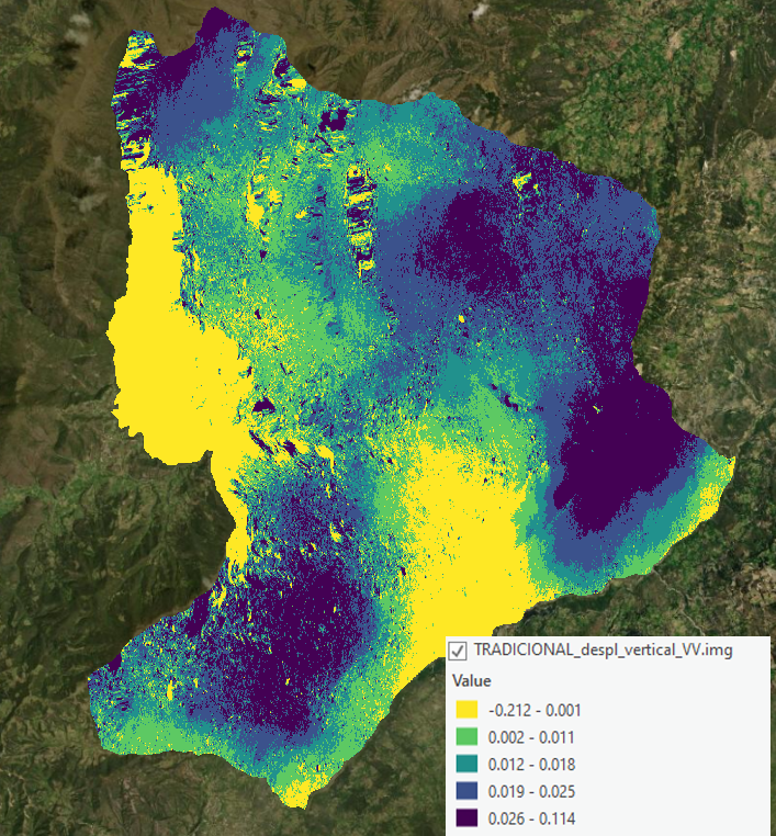
Then I could see how the data was visually divided into 5 very similar pixel classes, visually speaking, so I started to work with a new method, and after processing the data I classified the result, and this it is:
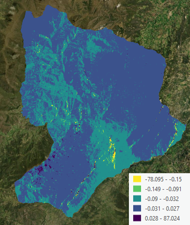
As you can see, although it is classified in quintiles (20%, 40%, 60% and 80% selected by ARCGIS Pro), the data is not visually expressed in quintiles. Initially I thought it was a problem with the range of values since about 20 pixels were abnormally low or high, so I decided with the arcgis pro tool to modify those pixels according to the average and this was the result:
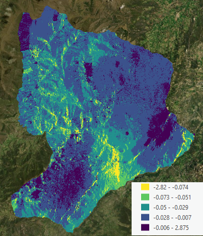
Although the result improves a lot visually, I do not think that the data is distributed in quintiles of 20%. What is the reason for the highly variable result of these quintiles? Are they related to the sum of the pixel value and not to the count of the number of pixels in similar classes?
Any help will be highly appreciated.