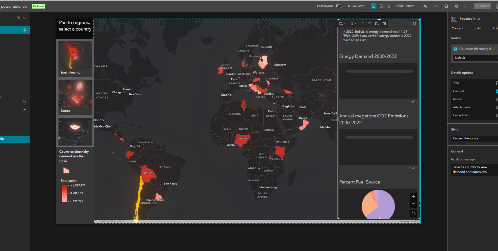
Hi, I recently wrote three Arcade expressions to display two line charts and one pie chart in a pop-up. The expressions were working fine and pop-ups were behaving as normal. I created both an instant app and an arcgis experience using the web map so I could dock the pop-up. These apps were then embedded in an ArcGIS Story Map slide. As of yesterday, everything was working as expected: Pop-ups rendered all three charts within the web map, instant app, and experience Feature Info widget; Apps rendered the pop-ups as expected in the Story Map... I made no changes to the code since it took me forever to write it. Anyway, today only the pie chart is rendering in the experience app and instant app. The Arcade expressions are essentially the same (except for pie vs line) but use different sql. Today the charts fail to render anywhere except for where I feature the Web Map directly into the Story Map (i.e., not via an application).
Here is my code:
function countryFMT(c) {
if (c == "Bosnia and Herzegovina") {
  return "Bosnia Herzegovina"
  } else {
  if (c=="Republic of Macedonia") {
  return "North Macedonia"
  } else {
  return c
  }
  }
  }
var country = countryFMT($feature.NAME_EN)
var table = FeatureSetByName($map, "EMBER yearly full release long format", ["Area", "Year","Variable","Value", "Unit"])
var sql = "Area = '" + country +"'" + "AND Variable = 'Total emissions'"
var related_records = Filter(table, sql)


var chartValues = {};
var chartNames = [];

for (var f in related_records) {
  chartValues[Text(f.Year,'0000')] = Text(f.Value,'##.#')
  Push(chartNames, f.Year)
}


return {
    type: 'media',
    title : 'Annual megatons CO2 Emissions 2000-2022',
    //description : 'Total emissions of CO2 in megatons for ' + country + ' from 2000-2022',
    attributes : chartValues,  // replace this dictionary with your own key-value pairs,
    mediaInfos: [{
        type : 'linechart', //linechart | barchart | piechart | columnchart
        //title : '',
        //caption : '',
        altText : 'line chart showing CO2 emissions in megatons by year', //altText will be read by screen readers
        value : {
          fields: chartNames,  // choose what attributes to use in the chart
          //normalizeField : '',  // the name of the attribute to normalize by or value
        }
      }]
  }
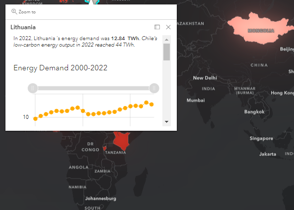
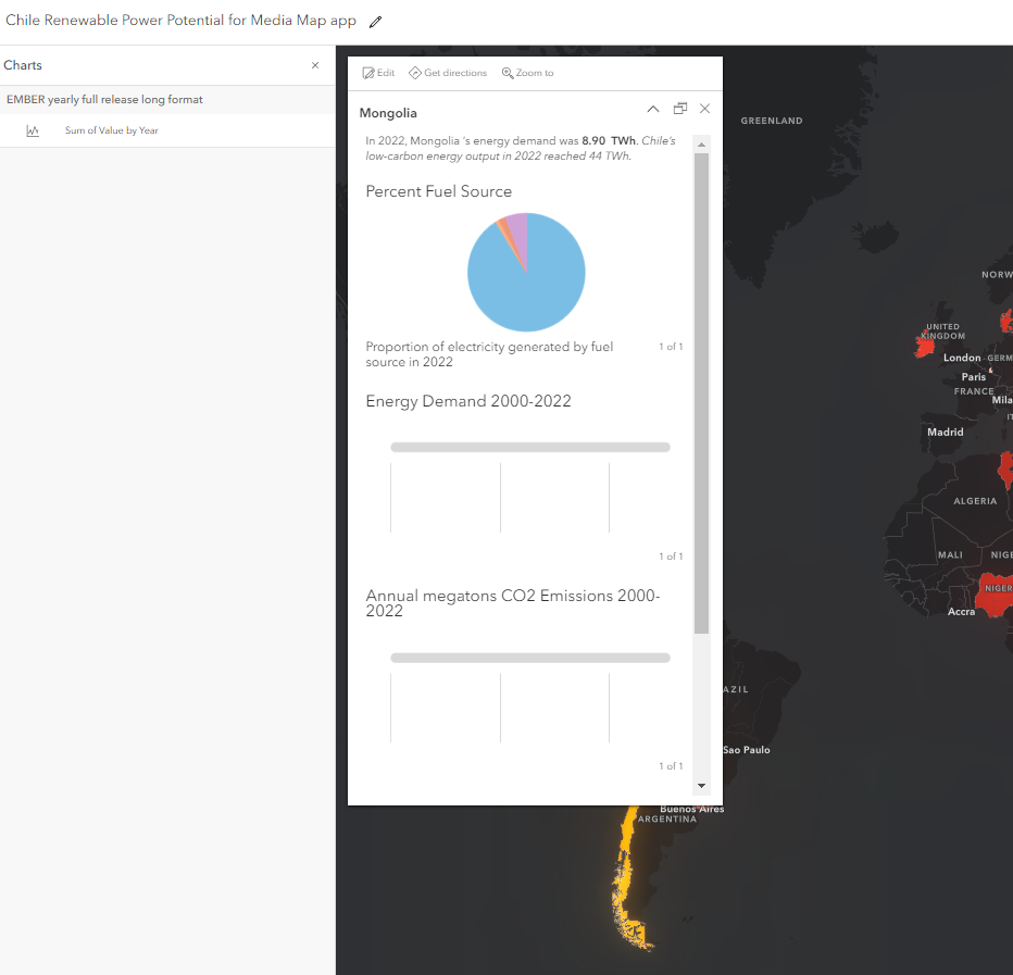
Here's a screenshot of how one of the charts render in story map and how it fails to render even in the webmap! Note, for some reason the pie chart uses different colors now. Totally at a loss.
StoryMap view:
WebMap View:
Experience view: