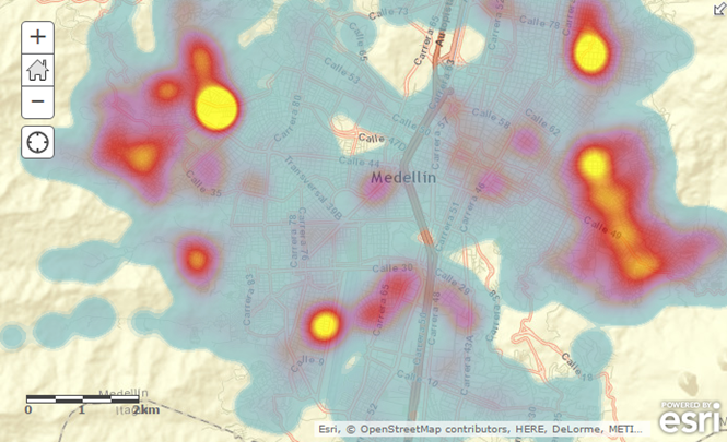
Recently I received a big pile of time-aware point data. It consisted of a little less than half a million points with from and to date fields. I was interested in seeing the spatial distribution of these points in time, so I decided to cook up some python code that would, at first, get me the number of days the point was “alive”:
import arcpy
import datetime

def main():
    fc = r'D:\Xander\Hidro\gdb\Hidro.gdb\SolicitudesFish250m'
    fld_fecha_from = 'FECHACREACION'
    fld_fecha_to = 'FECHAESTADOSOLICITUD'
    fld_out = 'Dias'

    cnt = 0
    flds = (fld_fecha_from, fld_fecha_to, fld_out)
    with arcpy.da.UpdateCursor(fc, flds) as curs:
        for row in curs:
            cnt += 1
            if cnt % 1000 == 0:
                print "Processing record: {0}  ({1})".format(cnt, dias)
            d_from = row[0]
            d_to = row[1]
            dias = getDays(d_from, d_to)
            row[2] = dias
            curs.updateRow(row)

def getDays(d_from, d_to):
    return abs((d_to - d_from).days) + 1

if __name__ == '__main__':
main()This allows for visualization of the points using the number of days to vary the color and symbol size.
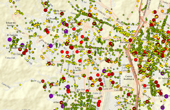
That is nice, but not yet what I am looking for…
So, I cooked up some more code to use the Kernel Density function of Spatial Analyst to create a kernel density raster of the point count in a radius of 250 meter for each month. I could have used the number of days field as population field, but I decided not to.
#-------------------------------------------------------------------------------
# Name:        kernelSolicitudes.py
# Purpose:     Kernel analysis of Solicitudes Hidro
#
# Author:      xbakker
#
# Created:     06/05/2015
#-------------------------------------------------------------------------------
from datetime import date, datetime
import arcpy, os

def main():
     # variables locales
    solicitudes = r"D:\Xander\Hidro\gdb\Hidro.gdb\SolicitudesFish250m_MCB"
    fld_fecha_desde = 'FECHACREACION'
    fld_fecha_hasta = 'FECHAESTADOSOLICITUD'
    fld_pop = "NONE" # "Dias"
    cellSize = 25
    searchRadius = 250
    units = "SQUARE_KILOMETERS"
    method = "DENSITIES"
    dist = "PLANAR"

    # rango de fechas a procesar
    loop_desde = date(2012, 3, 1)
    loop_hasta = date(2015, 5, 1)

    # ambiente
    ws = r"D:\Xander\Hidro\gdb\Heatmap.gdb"
    arcpy.env.workspace = ws
    ext = arcpy.Extent(820000, 1163000, 852500, 1203000)
    arcpy.env.cellSize = cellSize
    arcpy.env.extent = ext
    sr = arcpy.Describe(solicitudes).spatialReference
    arcpy.env.outputCoordinateSystem = sr
    arcpy.env.overwriteOutput = True

     # activar licencia Spatial Analyst
    arcpy.CheckOutExtension("Spatial")

    # procesar rangos de fechas
    cnt = 0
    for ano in range(loop_desde.year, loop_hasta.year + 1):
        for mes in range(1, 13):
            print "{0} - {1}".format(ano, mes)
            fecha_from = date(ano, mes, 1)
            fecha_to = getDateTo(ano, mes)
            if fecha_from >= loop_desde:
                if fecha_to <= loop_hasta:
                    cnt += 1
                    # generar Layer con rango de fechas
                    where = "{0} <= date '{1}' AND {2} >= date '{3}'".format(fld_fecha_desde, fecha_to, fld_fecha_hasta, fecha_from)
                    print " - {0}".format(where)
                    out_lay = "sol{0}".format("%03d" % (cnt,))
                    print " - {0}".format(out_lay)
                    arcpy.MakeFeatureLayer_management(solicitudes, out_lay,
                                                      where, ws)

                    # generar Kernel Density
                    nombre_ras = "sol{0}{1}".format(ano, "%02d" % (mes,))
                    print " - {0}".format(nombre_ras)
                    arcpy.gp.KernelDensity_sa(out_lay, fld_pop, nombre_ras,
                                              cellSize, searchRadius, units,
                                              method, dist)

    # devolver licencia Spatial Analyst
    arcpy.CheckInExtension("Spatial")

def getDateTo(ano, mes):
    if mes == 12:
        mes = 1
        ano += 1
    else:
        mes += 1
    return date(ano, mes, 1)

if __name__ == '__main__':
main()In order to be able to visualize these rasters as time-aware data, I created a raster mosaic dataset.
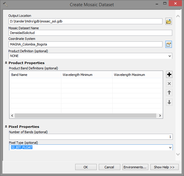
... and loaded the Kernel Density rasters:
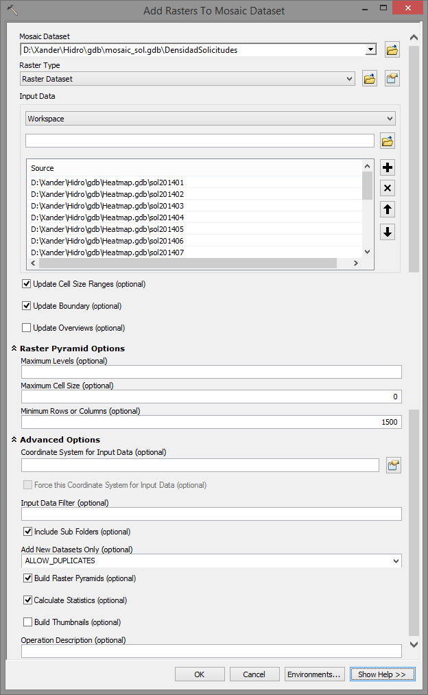
As you probably know a raster mosaic dataset consists of the boundary, footprint and image:
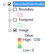
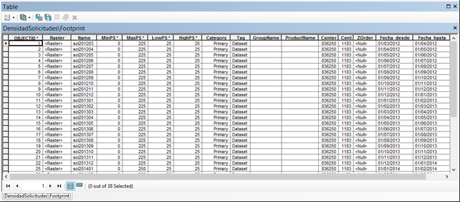
When you open the attributes of the footprint you can add fields that will hold the start and end dates for each individual raster:
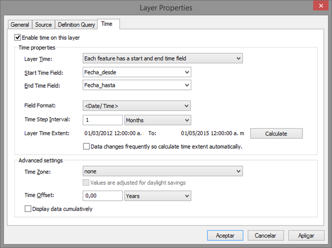
Once you have those additional fields, you can enable time on the raster mosaic dataset.
The next step is to publish the raster mosaic dataset. To do this you will need the Image Server extension on your ArcGIS for Server.
If you add the REST url of the published map service to a web map you can configure the time awareness of the layer. Just enter the options on the time slider and hit advanced options (sorry for the Spanish interface).
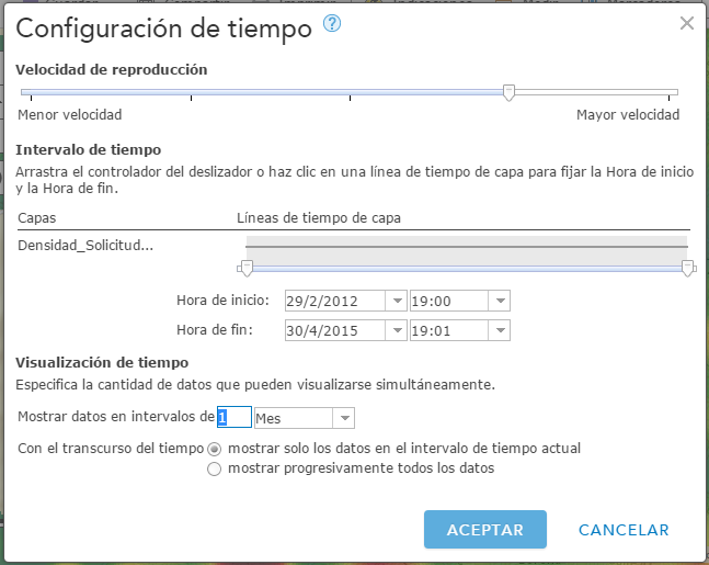
In this case I defined a 1 month interval which corresponds to the data. You can create a Web App using the Web AppBuilder and activate the Time Slider widget to visualize the time-aware data in your browser.
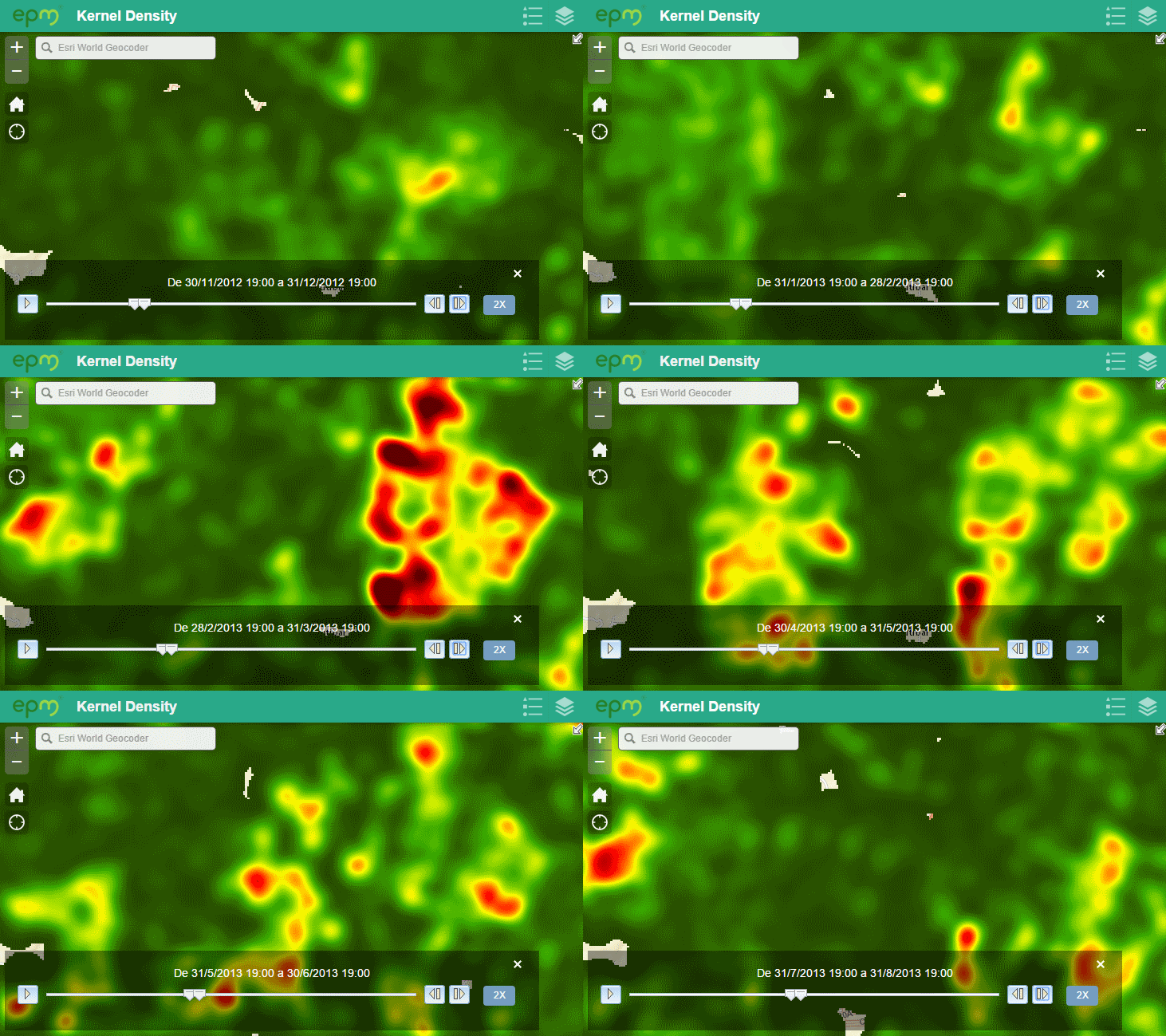
Obviously, the result is nice but completely static. It is nicer to connect to the source information (in our case this would require a query layer, since the data is stored in Oracle using SDO_GEOMETRY) and publish the points layer time-aware. Next using smart mapping you can create a heat map dynamically on the data, although this might yield the message that not all the data is displayed due to the large number of points.