Everyone is probably still enjoying the last rays of sunshine extensively – the weekend is supposed to bring autumn. So it's high time to plan the next vacation. But where to? To the sun!
"Yes, gladly, will you also pay for my flight?"
No, but I can show you a tool that can help you with the representation, visualization, and finding the needle in the data haystack and thus maybe let you enjoy the vacation a little better. In short, it's about Power BI.
A Business Intelligence (BI) tool from Microsoft that is currently on everyone's lips. Interesting because it is available for free download and the desktop version automatically includes a "Visual" from Esri.
With ArcGIS Maps for Power BI, you can quickly, easily, and attractively visualize geo-data in Power BI – including locations!
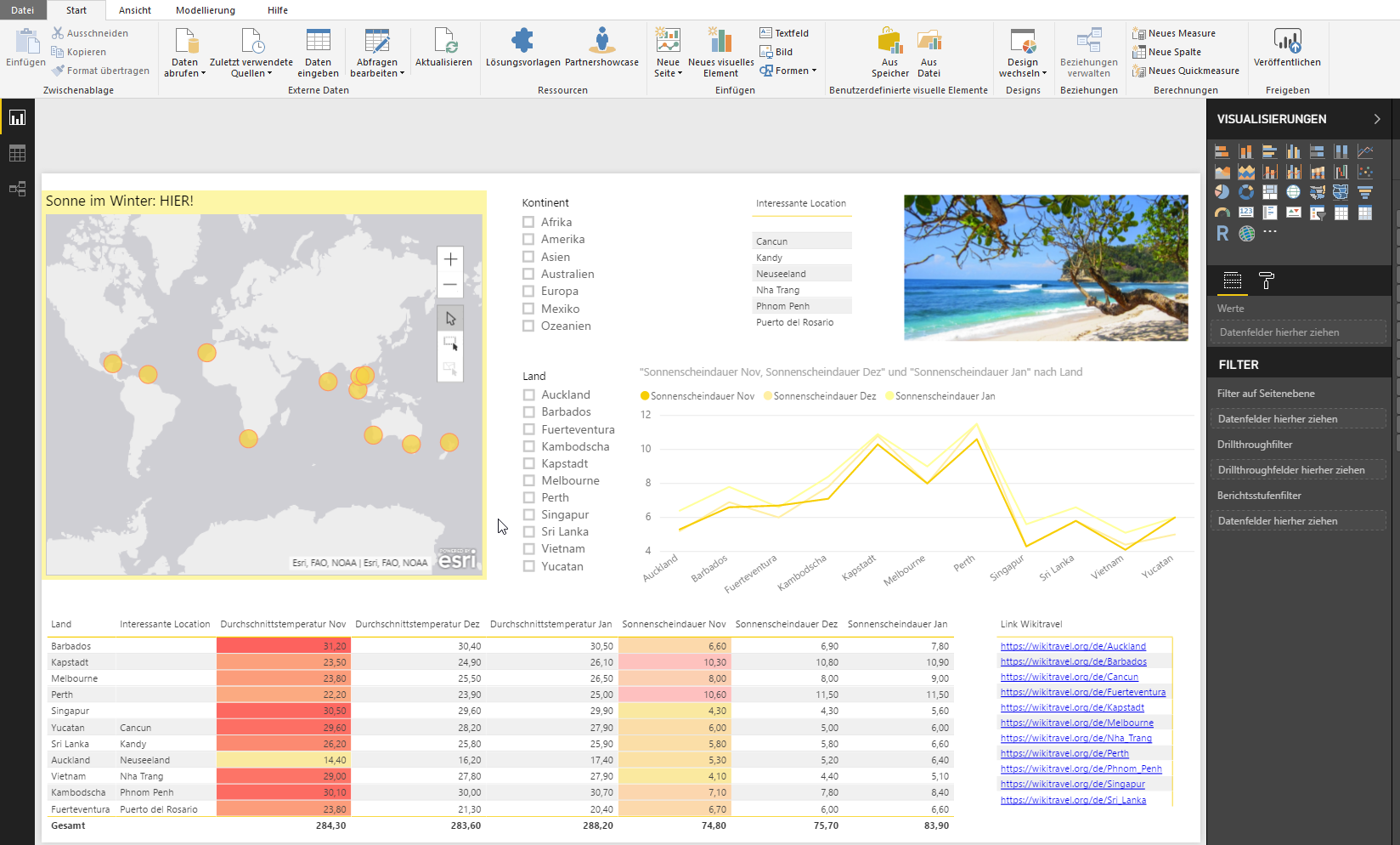
I have compiled my top 11 locations for sun in winter in an Excel table. This can now be easily loaded into Power BI. You can also import many other data formats; just click through to see what is possible.
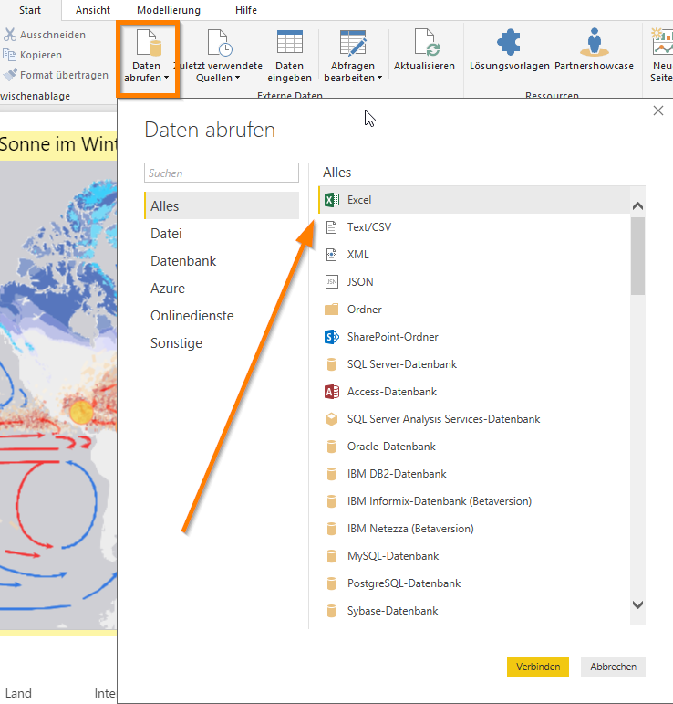
An import wizard follows that guides you through the process – here simply select the corresponding table.
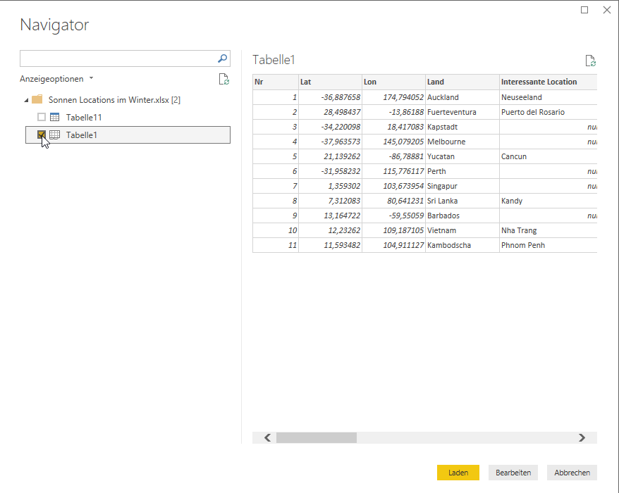
Then the data is edited if changes are necessary. I will show you what is possible in a later blog post.
Once the dataset is loaded, it can be easily dragged & dropped onto the Power BI page and visualized accordingly.
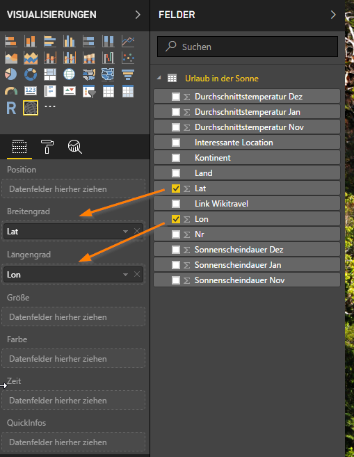
You can select different visuals or visualizations in the right workspace, from bar charts, line charts, and many more up to the ArcGIS Maps for Power BI visual.
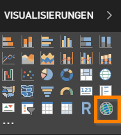
Select this and then you can simply put your coordinate fields (two separate fields for Lat/Lon) into the corresponding buckets and the map automatically zooms to the appropriate extent.
The highlight though: the editing mode. Here there are different Smart Mapping methods to make the map visually appealing quickly and easily.
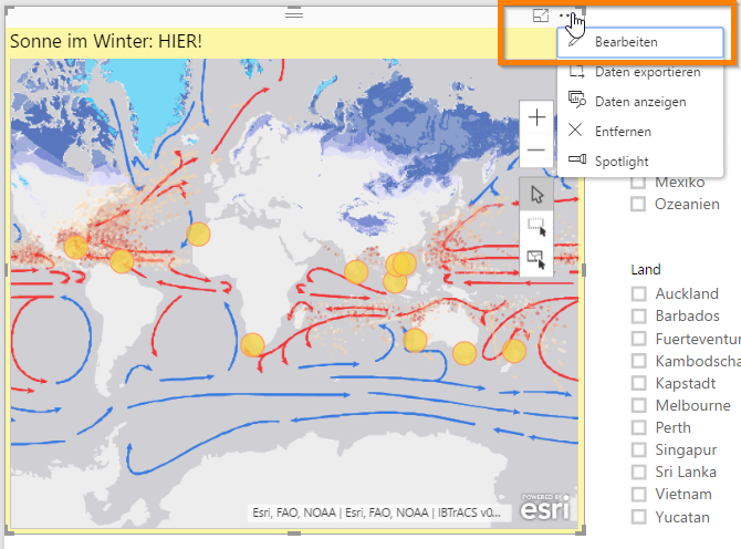
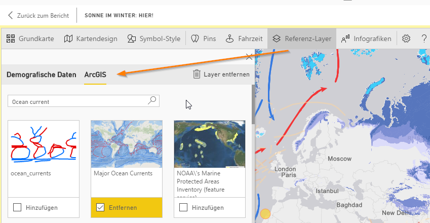
I added ocean currents (search for Ocean current) via public layers available in ArcGIS Online and made the locations a bit more sun-like.
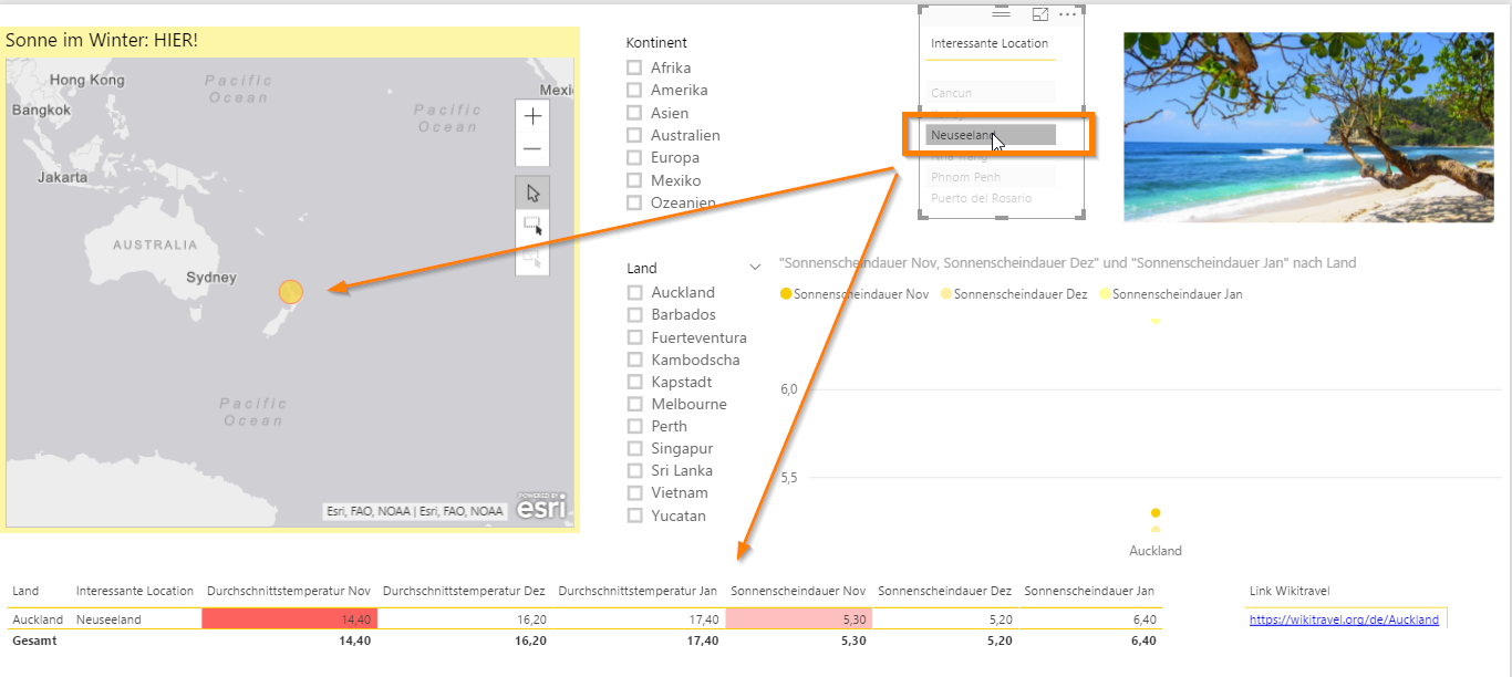
It works similarly with tables and other visuals: just either select a visual and fill it with values or simply drag a field onto the page and then select another visual accordingly.
The great thing now is that a selection, e.g., in a table, affects all other visuals. So if you select New Zealand, all other representations are reduced to New Zealand and you get a better insight into the data.
For easier entry and self-testing, my Power BI version is attached.
Of course, you can also prepare location data of newly planned shops, competitor locations, or ski resorts intended for winter vacations and examine them in detail accordingly (or calculate travel times and display infographics).
More next time, have fun planning your trip!
Ah, and if anyone has a tip, either fill Excel accordingly or post a insider tip in the comments. And yes, we're among ourselves...
