I am building my story with the Journal Map template. I bring an image to be in the main section and have content in the menu bar. , I'm running into a problem with scale of my image in the main section when I resize my browser because it's responsive app but my image doesn't re-scale based on that.
Please see my attachment.
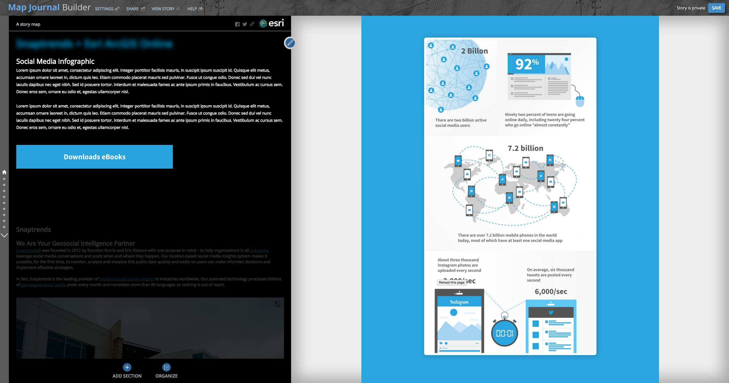
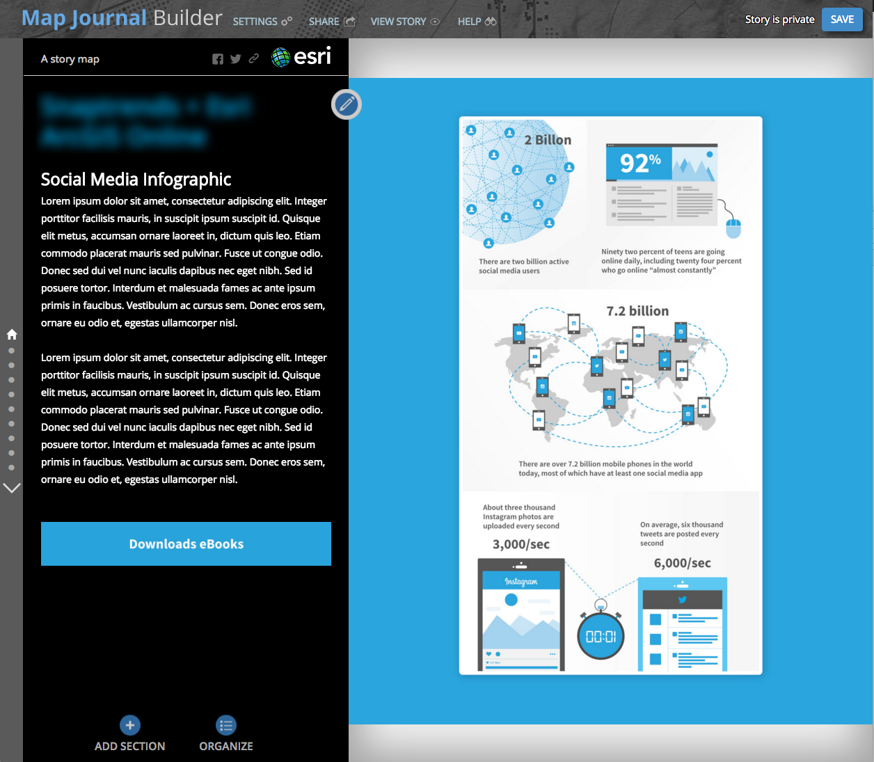
In order to cover the gray background, I put the blue background behind my main image but it doesn't help anyways. This is a great custom story map I found as an example: The Amazonian Expeditions of Richard Evans Schultes . As you scale this story map in many different sizes, the entire story map gets adjusted to the browser. Is there a way that I can fix my issue to that level?
Thank you for your time.