I have created a simple histogram chart from data in arcpro 3.7 grouped by sediment size. Data is displaying as expected except a purple border around one of the graphs, I show this below.
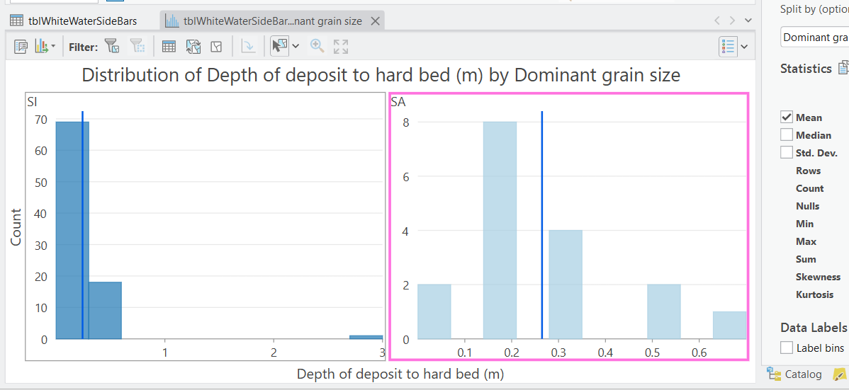
How on Earth do I remove this border? It seems like an unintended bug? I've tried holding down crtl or shift and clicking on graphs but nothing seems to remove it, at best by clicking on the other graph the border swaps over to the other graph. It means I can't copy the chart to clipboard to insert into a report as it retains the irritating purple border.
Any advice?
Duncan