ArcGIS Business Analyst Web App Advanced is set to receive an exciting new feature in the upcoming October 2025 release: Nearby analysis workflow.
The new nearby analysis workflow enables users to analyze sites by adding curated collections of points of interest (POI) to your map. In this workflow, users can combine multiple POI searches together, refining by featured layers of points, custom points of interest lists, or your own imported web layer!
These results will provide insights based on the analysis of POIs in close proximity to your defined area or interest. Discover result figures like total points per area, distance from each location to its corresponding area, as well as the density or saturation of locations within each area. Reminder - this new workflow will only be available to users with Business Analyst Web App at the Advanced license level.
Many industries will benefit from this new workflow, with applications in retail, healthcare, and logistics. Use the nearby analysis tool to optimize store locations and conduct targeted marketing, improve delivery efficiency for e-commerce businesses, or identify under-served areas to plan for healthcare clinic expansion.
To launch the new workflow, select Nearby analysis from the Run analysis menu.
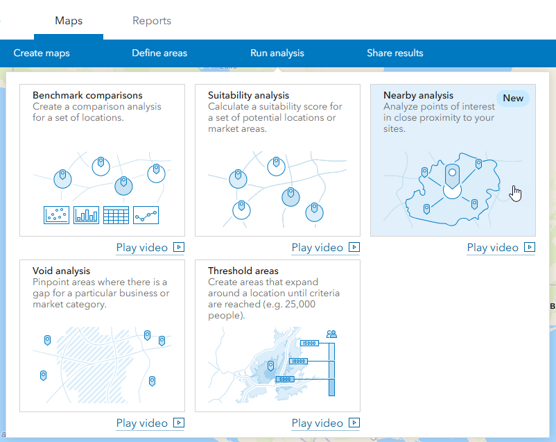
From there, running the analysis is simple with guided steps prompting you along the way.
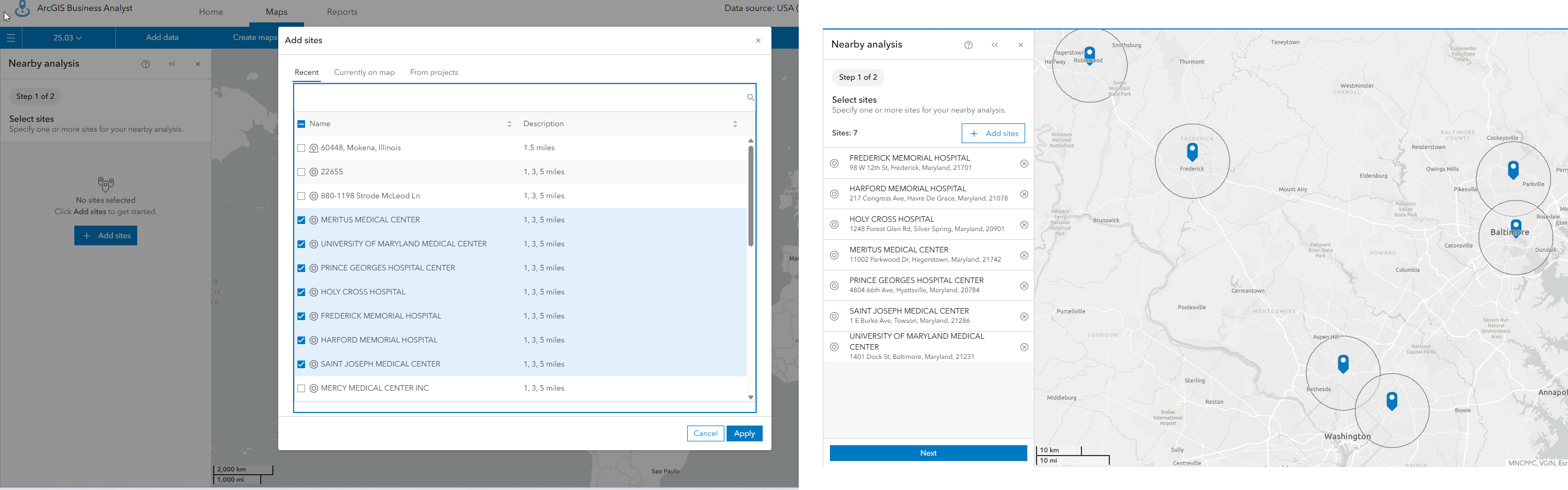
Step 1: Define Area of Interest
First, you’ll be prompted to select an area of interest using point-based sites (rings, drive time, walk time, or threshold areas) to define the area of interest.
Step 2: Select a Point List
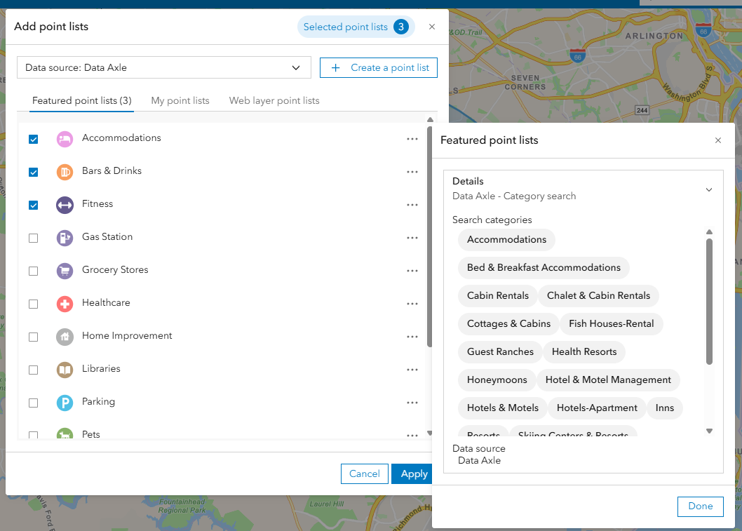
Points lists are groups of points of interest which will be analyzed together. You’ll have the option to choose from Featured point lists, My point lists, or Web layer points lists.
Featured Point lists are Esri provided data points lists which have been curated and grouped by category. These may be attributes like Bar & Drinks, Grocery Stores, Healthcare, Gas stations, or Accommodations. Featured point lists are pulled from a selected data source and are represented with unique icons for each point type. You can expand a category using the ellipses button on the right to see all categories of POIs included in each list.
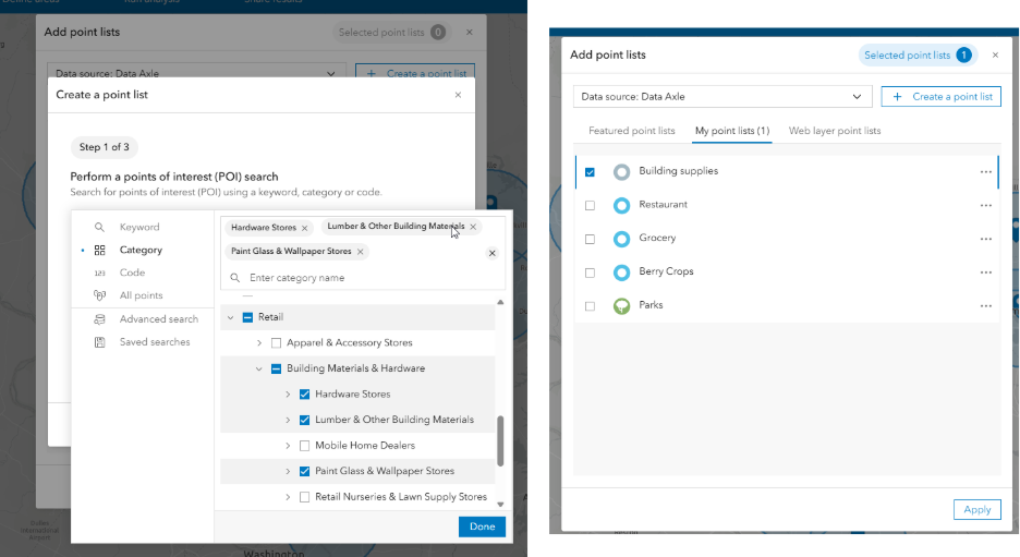
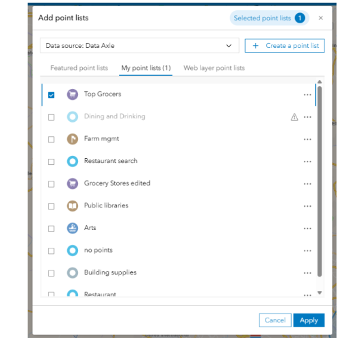
My points lists are another option to use in the analysis. This option is similar to using a saved search in the POI search workflow. Say you don’t want to pull from the curated featured point lists and instead want to use a saved list of Esri provided points of interest using your own name.
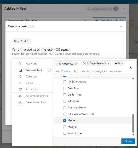
To create your own points list, begin by searching for points of interest using a keyword, category, or code. What’s exciting in this update is also the edition of the “Top retailers” category of points of interest. This POI list can be used to create a custom layer of points based on retail categories like “grocery”. Simply select Top retailers and search for a company or business name in the dialog box:
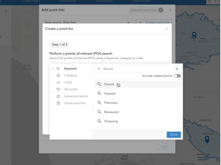
To create your own list from POI search, type the keyword into the search. For example, say we want to create a list to use in a nearby analysis using points related to dental offices. You can start by searching for keyword “Dentist”:
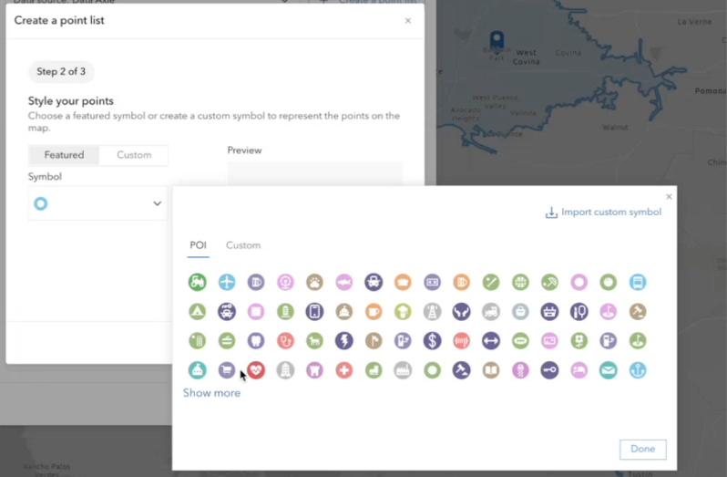
Next, I would assign a symbol to represent this point layer, either from a featured list of icons in the web app or by uploading my own custom symbol.
Finally, I’d chose a name for the new point list:
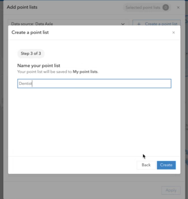
After clicking continue, this new customized point list will show up in “My point lists” and will be available to select in the workflow for my project.
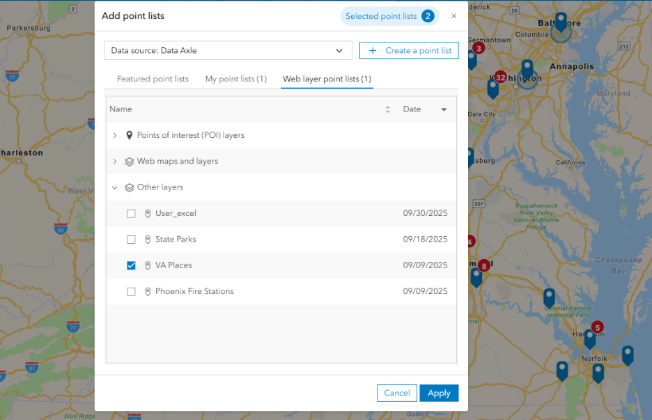
One of the features we are most excited about including in this new workflow Web layer point lists. This tab provides users with the ability to import your own layers of points to run analysis. This was a highly requested capability by our users. To use your own layers, just add point layers to your project then these layers will be accessible to select in the workflow. Web layer point lists include your saved Points of interest search layers, web layers added from ArcGIS Online, and point layers created from imported data.
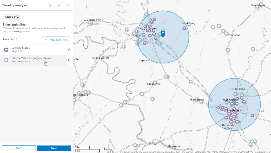
This new list is especially useful since one or more lists can be selected in the Nearby analysis workflow, and these lists can combine Esri provided and custom data. For example, you can select a featured point list and a custom web layer point list to compare the sites. The example below uses the featured point list Grocery Stores and an imported web layer point list titled Electric Vehicle Charging Stations:
Step 3: See Results
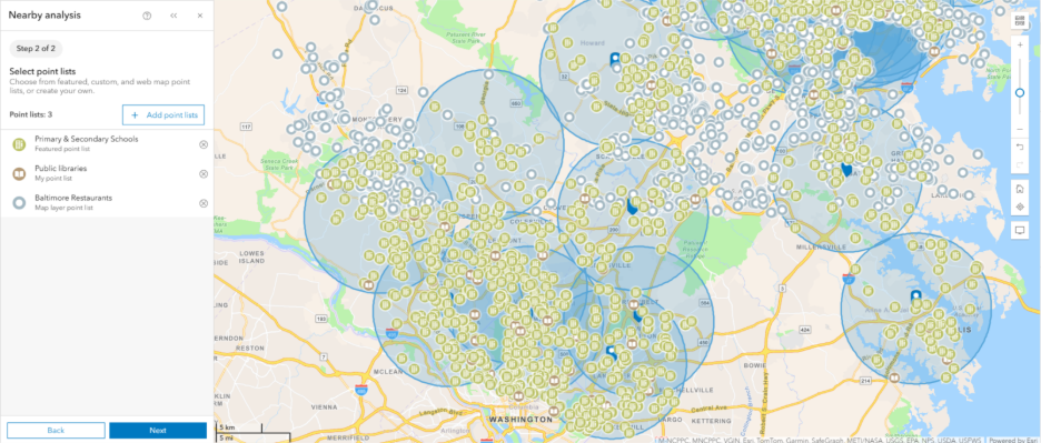
You can select a combination of lists from any of the 3 tabs. Once lists have been selected, a preview of the points is shown on the map. In the preview, featured point lists and My points lists will show only points that fall within the area of interest. Your custom Map layer point lists will show a preview of all of the points in the web layer to help with awareness of the location of the custom points. Click Next to see results.
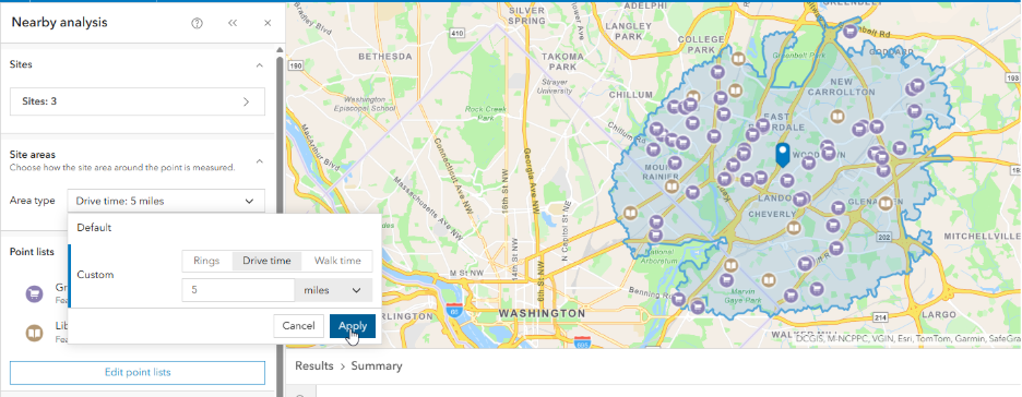
You can change the shape of your point-based sites on-the-fly if needed. For example, I can change my ring-based sites to drive times just for my nearby analysis.
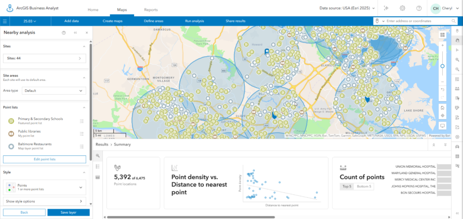
Results are displayed with the Summary tab shown in the Results pane. When results are displayed, any Web layer points that fall outside the area of interest are hidden. The workflow pane can be used to identify nearest points, as well as to understand distances, relationships and density. The Summary tab includes count of locations, scatterplot (if using 2 or more sites), and top/bottom 5 charts for counts, distance and density.
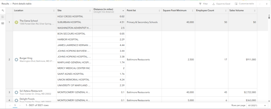
The Results pane also includes tabs for displaying your analysis details in a Point details table and Site summary table. These tabs can be filtered and customized to show only the relevant details in your analysis.
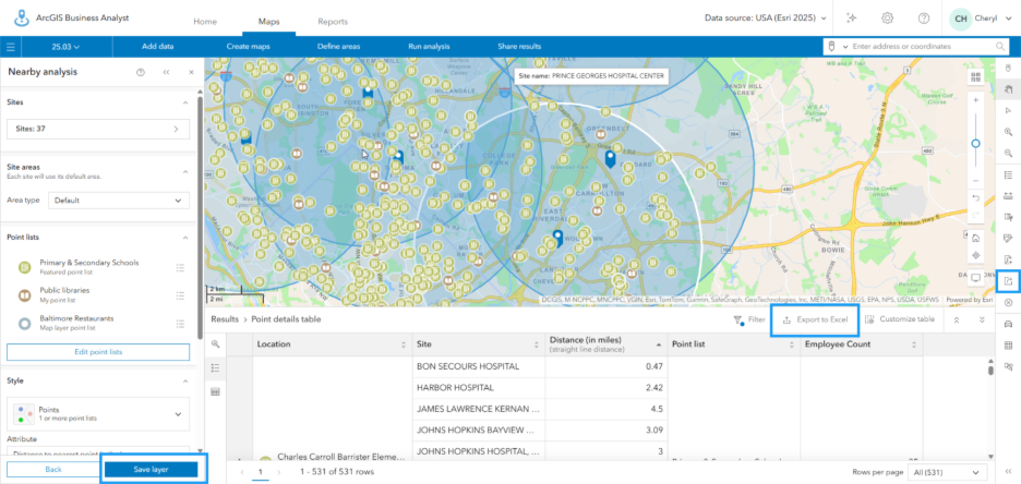
The Point details table shows an overview of information on the points displayed, such as name, site location, distance, and the point list group that it belongs to with its appropriate icon.
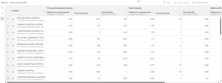
The Site summary table includes a summary of distance and density by site for each point list. You can filter to show one Point list or multiple lists.
Results can then be Saved as a layer to use in later analysis or Exported using Excel or Web map options.
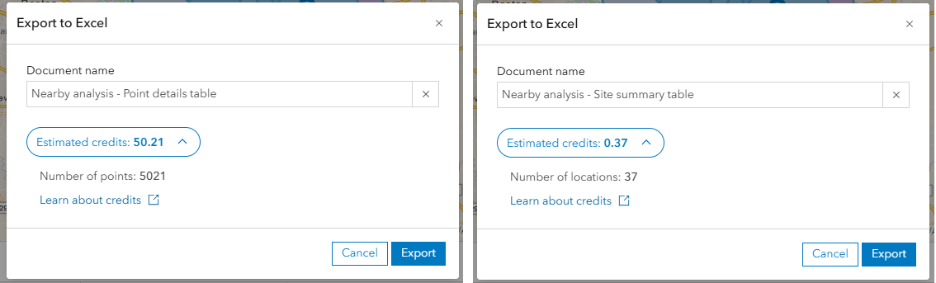
Credit transparency is something we are working to improve in this and future updates of the Web App. Credits can be estimated when exporting to Excel. Point details credits are estimated based on the number of point records. Site summary credits are estimated based on the number of sites or locations. When using custom web layers, credits are not charged for associated records in the Point details tab.
We can’t wait to share this exciting new tool with you in the coming weeks and to receive feedback on how users are streamlining their workflows and deepening their analysis to achieve data-driven results. The team plans to continue developing this workflow with more features to be added in later releases!