The current design philosophy of Pro has some aspects of the UI too minimalistic and makes it hard to see or differentiate between states.
Please increase the contrast and/or update the styles just a little bit.
This will make it so much easier to notice the various states the interface components are in.
Examples
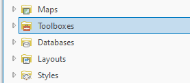
The catalog pane is not active:
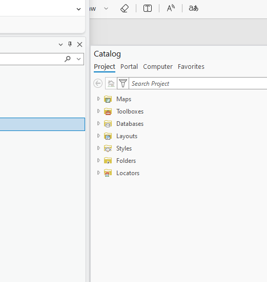
The catalog pane is active:
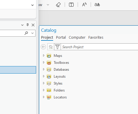
Item highlighted:
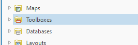
Item selected:
Attribute table inactive:
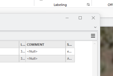
Attribute table active:
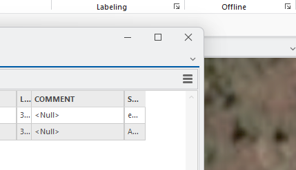
I understand the appeal for subtlety but with large monitors and many panes/windows/tabs, having better visual cues makes you more efficient. It is the difference between 'at a glance' vs 'looking for'.
In some ways I find the contrast better in light mode than dark mode, but the same issues remain.