I found a default chart in an example analysis for ArcSOC counts. Wondering if the Y axis "scale" can be adjusted? Seems it stops at 100 and would like that to display to say 200 (max recommended SOC's) on a server. You can pause on the server and it gives you the actual count, but would prefer that to either show complete graph and or display the count.
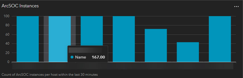
If i change the Statistic field from maximum to count, they all return 30?
I will confess that I am super green to tweaking these collections/analysis but starting to get request from end users to display some finer details.
See attached for the chart set to Maximum.
Thanks.