I am using ArcGIS Enterprise 10.9.1 (we have to use this version to maintain compatibility with the ArcMap Runtime).
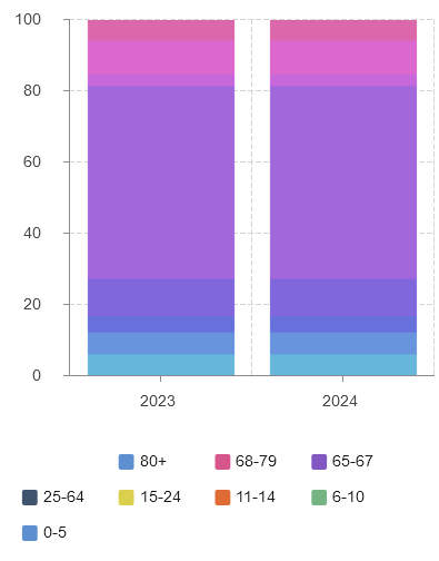
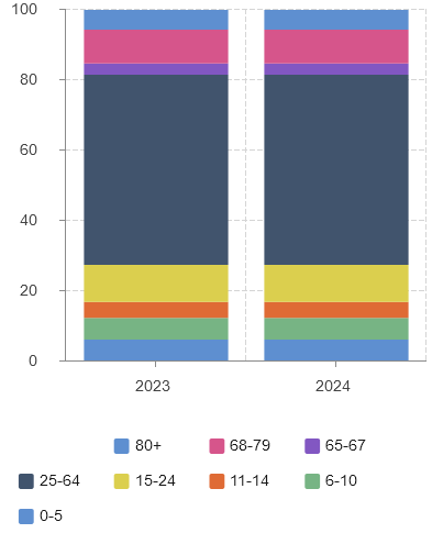
In EB if I use the Chart Widget and use more than one Series i get a default color ramp that is different from the selected colors (either automatically defined by EB or user defined). However, if I select something within the chart, the correct solors will then be displayed. I have posted two screenshots, the first is before the selection, the second is after a selection is made.
I have tried searching both on the forums and on google and have not found anyone with a similar issue. Am I missing a configuration somewhere? or is this a bug?
Any suggestions for how I can use charts without using this workaround?