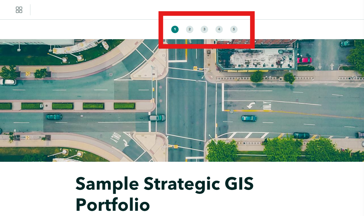
Currently, we can adjust the appearance of a StoryMap Collection's landing page via themes (which is great!). However, the themes do not apply to the header navigation buttons for both the tabbed and bulleted layouts. The backing color instead retains the default StoryMaps teal.
It would be great if the StoryMap Collection pulled the color for these from the Button settings within the applied theme. Or if there are concerns with introducing accessibility issues here, at least giving users the option to change it to some neutral color combination like grey and black.
This would be beneficial for organizations with strict branding policies, as well as to simply help the Collection appear more cohesive.