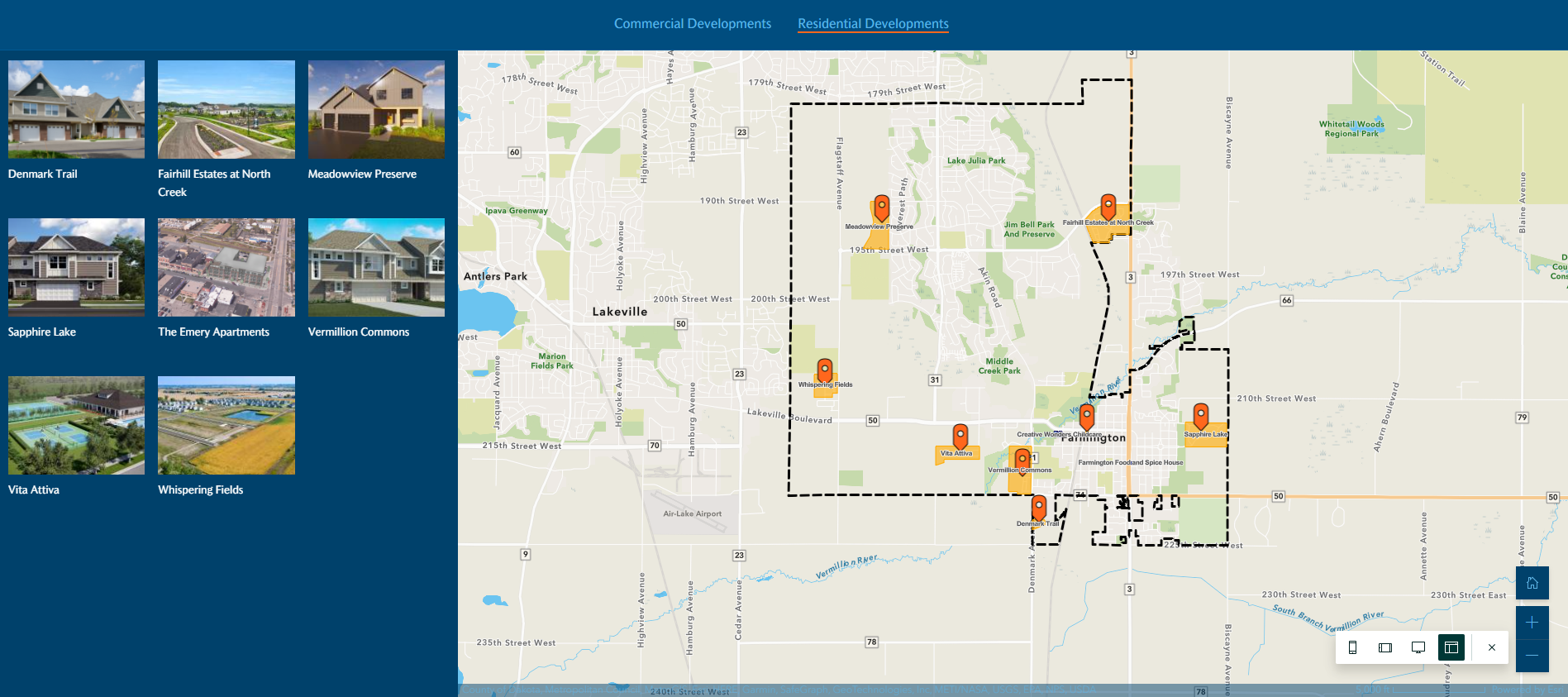
I used this resource to create a StoryMap template similar to the "Shortlist" layout from the classic templates. My issue is that when turning on Story Navigation (7:00 mark in the tutorial video), clicking on the headings doesn't display the grid icons in a visually pleasing way. Instead of all of the grid icons being centered on the screen upon clicking the heading, you have to scroll to view all of the icons. The map is also not fully in display and you're required to scroll a bit to see the entire map window. At 8:46 in the video, you can see what I mean. Is there any way to fix this? The classic Shortlist layout visually compartmentalized things better.
I've tried to replicate this layout in Experience Builder but haven't had much luck.
What the layout looks like when you click on a section:
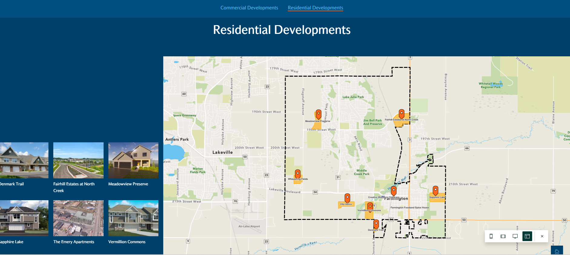
What I wish it would look like: