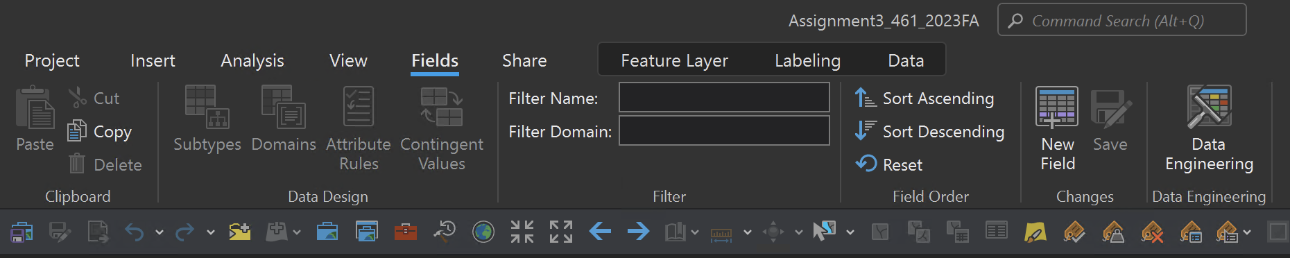

When working in the fields view, for example, the fields options appear in a really strange location - between the view and share tab. It also removes other tabs from the ribbon. The table view, by comparison, appears darker, to the right of share, and does not remove any commands from the UI. The constant shifting of UI elements is a pain for muscle memory and getting anything done quickly. Why not make the fields tab behave as the table tab does for consistency?