Hello everyone,
I wanted to ask a very specific question over here. I made a web-app from scratch (blank page) using Experience Builder. I have almost finished it and was in the testing phase, where I am facing issues with page elements (different widget like text, image etc.) are behaving differently (visible differently) in different laptop screens according to their size. So, Here I am not sure what settings of the widgets need to be changed to make it look static across all the screen sizes and not change dynamically.
I have prepared my app for desktop screen size for now and it should be seen like this-
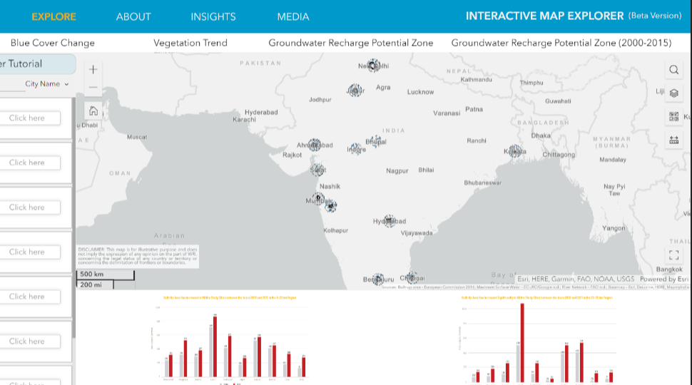
But instead, in a smaller laptop screen size, it is visible like-

As you can see the title text is cut down and similarly other elements screen size also changes a bit when viewed on a slightly different screen size. Can anyone please suggest me any process which can fix my widget sizes to be visible with the same dimensions across all laptop screens.