Hello,
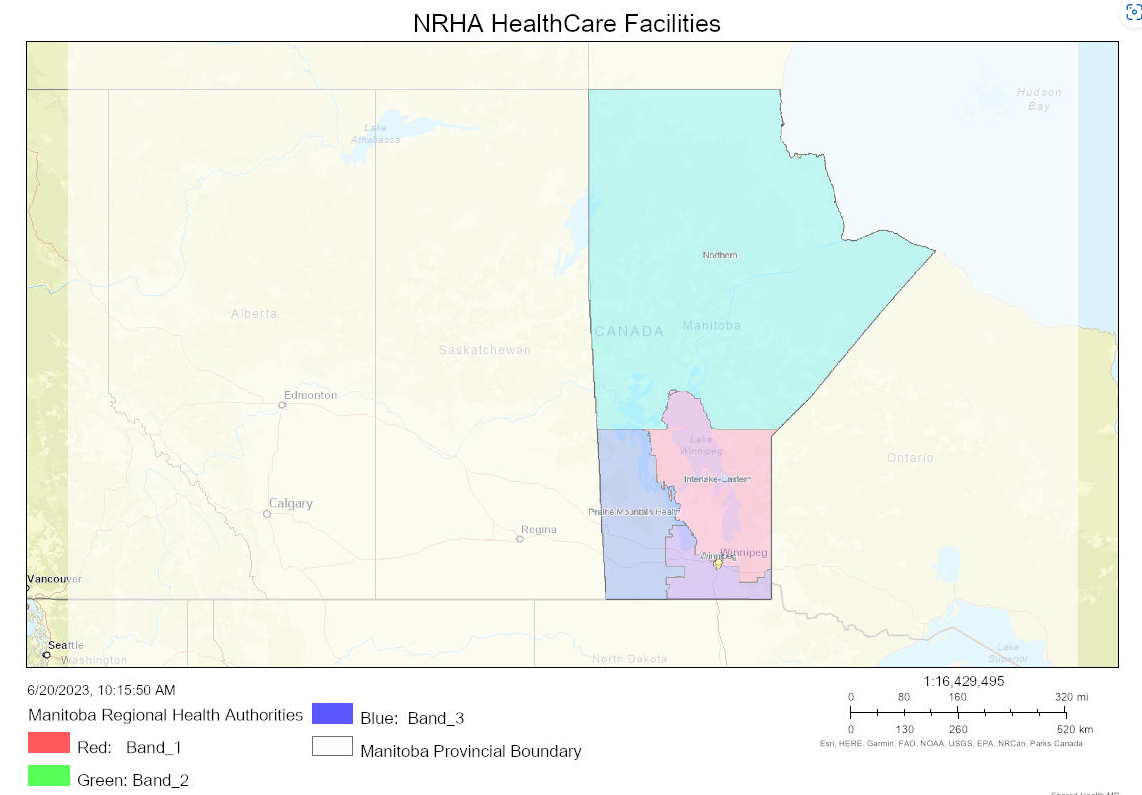
When using the print widget, the legend for my data layers shows red, green and blue bands instead of the actual categories within that data layer. The actual categories are the 5 health regions in Manitoba in green, blue, pink, purple and yellow color. Kindly assist me in getting the legend the right way in the printed map.
Additionally, is there a way to remove the semi-white coverage over the map extend?