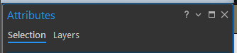
Pro provides an inconsistent experience when it comes to in-app documentation. Some panes/pane tabs have a '?' in the header:

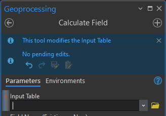
Some have a '?' button in a different location:
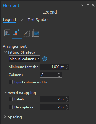
Sometimes that '?' only pertains to one specific parameter:
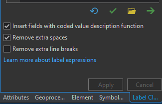
Some panes have just a plain text link thrown in there somewhere:
And others have no help at all:
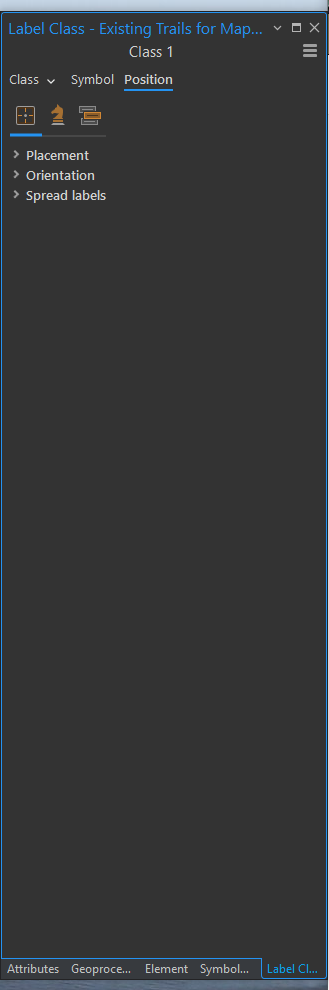
For the sake of usability, it would help a lot if the way documentation is presented could be more consistent, and more importantly, added to the panes that lack direct links to documentation that can help understand what's being presented.
Also, many panes supplement the links with an 'i' that doesn't actually require you to open a browser. Sometimes it's to the left:

Other times it's to the right:
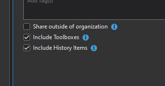
Oh, and other times, there is a tooltip without the little 'i' -- which I prefer since the hover target is larger:
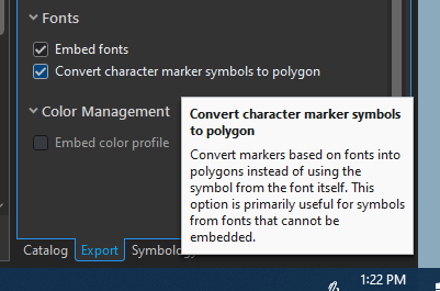
I find myself getting easily lost in the online labeling documentation, so something like this applied consistently across the application would be nice, too -- in addition to more consistent linkages to the full documentation.