Hello everyone,
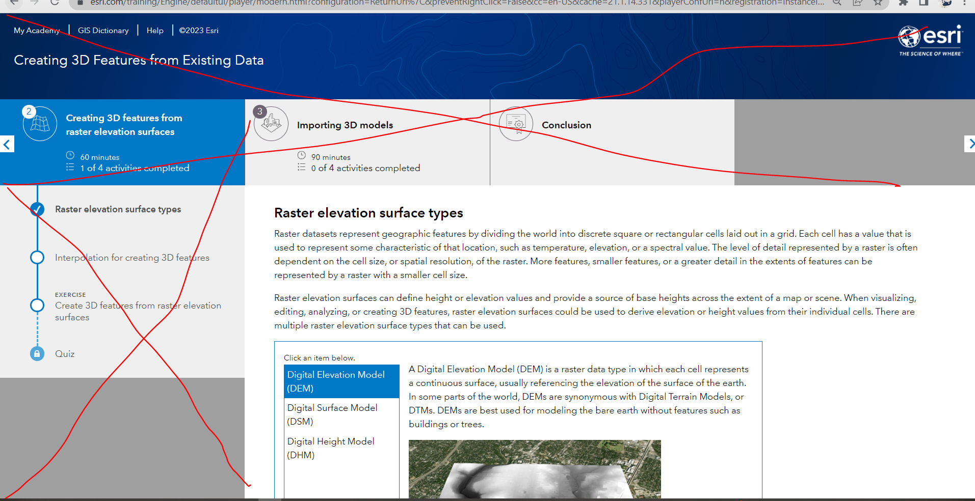
unpopular opinion maybe, but I am tired of the training page layout.
I am trying to study on my laptop and I started to hate the training portal.
Half of the screen is taken by the top banner and the left section. Is that necessary? That space is useless, is there a way to minimize it?
I would like to use my tablet as a reader so that I don't need to switch between PRO and training page but on tablet, it is even worse.
Resolution is the optimal one for my laptop and the zoom of the browser is at 90%.