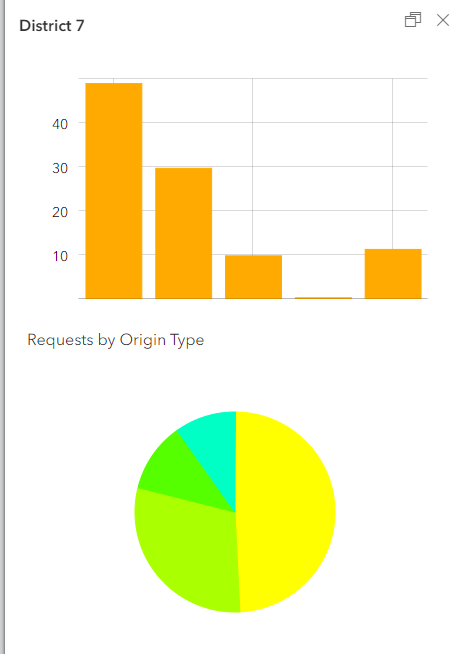
Hello, I am trying to implement Charts as ways to view data in pop-ups, but they are not customizable enough. I need to be able to adjust and apply unique colors by value to fit our organization's style guide, as well as label the categories. Hover over is not enough and very cumbersome.
The user does not gain much from either of these charts at quick glance...
Thanks!


