Hi there, I'm enjoying the Predominant Category symbology style available in ArcGIS Online, however I am finding it difficult to label the results I am showing. I want to show the predominant category + value as labels in the map. It would be great if the result automatically became available as a label when using this style.
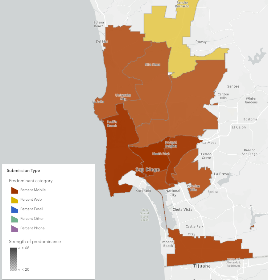
But since it's not...
When I bring the map into ArcGIS Pro, I can see the Arcade snippet driving the symbology, but I am not good enough with Arcade to adapt it to show me the predominant category + value as a label. Using maxValueField only gives me the predominant field... anyone have suggestions to return the value as well?
var dec_var_P_Phone=$feature.P_Phone;var dec_var_P_Mobile=$feature.P_Mobile;var dec_var_P_Other=$feature.P_Other;var dec_var_P_Web=$feature.P_Web;
  $feature["P_Phone"];
$feature["P_Mobile"];
$feature["P_Other"];
$feature["P_Web"];


  var fieldNames = [ "P_Phone", "P_Mobile", "P_Other", "P_Web" ];
  var numFields = 4;
  var maxValueField = null;
  var maxValue = -Infinity;
  var value, i, totalValue = null;

  for(i = 0; i < numFields; i++) {
    value = $feature[fieldNames[i]];

    if(value > 0) {
      if(value > maxValue) {
        maxValue = value;
        maxValueField = fieldNames[i];
      }
      else if (value == maxValue) {
        maxValueField = null;
      }
    }

  }

  return maxValueField;
Thank you!