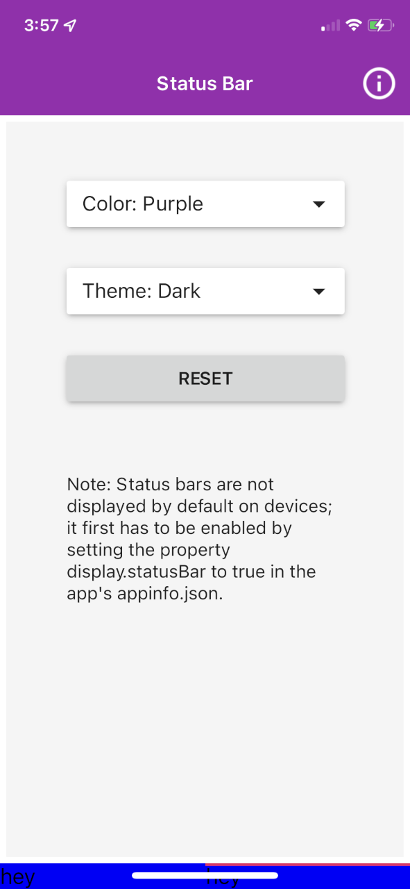
Using the StatusBar app template, if I add a footer of type TabBar to the App, it is pushed down below the screens painted area. If I exaggerate the height to 100 or more then the footer moves up into the view more. I'm just worried this may create an abnormally large footer on some devices.
/* Copyright 2021 Esri
 *
 * Licensed under the Apache License, Version 2.0 (the "License");
 * you may not use this file except in compliance with the License.
 * You may obtain a copy of the License at
 *
 *    http://www.apache.org/licenses/LICENSE-2.0
 *
 * Unless required by applicable law or agreed to in writing, software
 * distributed under the License is distributed on an "AS IS" BASIS,
 * WITHOUT WARRANTIES OR CONDITIONS OF ANY KIND, either express or implied.
 * See the License for the specific language governing permissions and
 * limitations under the License.
 *
 */

import QtQuick 2.9
import QtQuick.Layouts 1.1
import QtQuick.Controls 2.2
import QtQuick.Controls.Material 2.2
import QtGraphicalEffects 1.0
import QtQuick.Dialogs 1.2
import QtQuick.Layouts 1.3

import ArcGIS.AppFramework 1.0
import ArcGIS.AppFramework.Platform 1.0

import "controls" as Controls

AppLayout {
    id: appLayout
    width: 400
    height: 750

    delegate: App {
        id: app
        height: appLayout.height
        width: appLayout.width

        function units(value) {
            return AppFramework.displayScaleFactor * value
        }

        property real scaleFactor: AppFramework.displayScaleFactor
        property int baseFontSize : app.info.propertyValue("baseFontSize", 15 * scaleFactor) + (isSmallScreen ? 0 : 3)
        property bool isSmallScreen: (width || height) < units(400)

        StackView {
            id: stackView
            initialItem: landingPage
            anchors.fill: parent
        }

        Component {
            id: landingPage

            Page {
                header: ToolBar {
                    id:header
                    width: parent.width
                    height: 50 * app.scaleFactor
                    Material.background: Material.color(Material.Purple)
                    Material.elevation: 0
                    Controls.HeaderBar{}
                }

            footer: TabBar {
                contentHeight: 60 * app.scaleFactor
                position: TabBar.Footer
                background: Rectangle {
                    anchors.fill: parent
                    color: "blue"
                }
                TabButton {
                    height: 60 * app.scaleFactor
                    Text {text: "hey"}
                }
                TabButton {
                    height: 60 * app.scaleFactor
                    Text {text: "hey"}
                }
            }

                Rectangle {
                    anchors.margins: 5 * app.scaleFactor
                    anchors.fill: parent
                    color:"#F5F5F5"

                    // sample starts here ------------------------------------------------------------------

                    ColumnLayout {
                        id: contentColumn
                        anchors.fill: parent
                        spacing: 20 * app.scaleFactor

                        Item {
                            Layout.preferredHeight: 20 * app.scaleFactor
                        }

                        ComboBox {
                            id: colorBox
                            Layout.alignment: Qt.AlignHCenter
                            displayText: "Color: " + currentText
                            currentIndex: Material.Purple
                            Layout.preferredWidth: parent.width * 0.7

                            model: ListModel {
                                ListElement { name: "Red" }
                                ListElement { name: "Pink" }
                                ListElement { name: "Purple" }
                                ListElement { name: "DeepPurple" }
                                ListElement { name: "Indigo" }
                                ListElement { name: "Blue" }
                                ListElement { name: "LightBlue" }
                                ListElement { name: "Cyan" }
                                ListElement { name: "Teal" }
                                ListElement { name: "Green" }
                                ListElement { name: "LightGreen" }
                                ListElement { name: "Lime" }
                                ListElement { name: "Yellow" }
                                ListElement { name: "Amber" }
                                ListElement { name: "Orange" }
                                ListElement { name: "DeepOrange" }
                                ListElement { name: "Brown" }
                                ListElement { name: "Grey" }
                                ListElement { name: "BlueGrey" }
                            }

                            delegate: ItemDelegate {
                                id: colorDelegate
                                text: modelData
                                width: colorBox.popup.width

                                Rectangle {
                                    anchors.fill: parent
                                    parent: colorDelegate.background
                                    color: Material.color(index)
                                }
                            }

                            onCurrentIndexChanged: {
                                StatusBar.color = Material.color(colorBox.currentIndex)
                            }
                        }

                        ComboBox {
                            id: themeBox
                            Layout.alignment: Qt.AlignHCenter
                            displayText: "Theme: " + currentText
                            currentIndex: Material.Dark
                            Layout.preferredWidth: parent.width * 0.7

                            model: ListModel {
                                ListElement { name: "Light" }
                                ListElement { name: "Dark" }
                            }

                            delegate: ItemDelegate {
                                id: themeDelegate
                                text: modelData
                                width: themeBox.popup.width
                            }

                            onCurrentIndexChanged: {
                                StatusBar.theme = themeBox.currentIndex
                            }
                        }

                        Button {
                            Layout.alignment: Qt.AlignHCenter
                            Layout.preferredWidth: parent.width * 0.7
                            text: "reset"

                            onClicked: {
                                StatusBar.theme = Material.Dark
                                themeBox.currentIndex = Material.Dark
                                StatusBar.color = Material.color(Material.Purple)
                                colorBox.currentIndex = Material.Purple
                            }
                        }

                        Item {
                            Layout.preferredHeight: 10 * app.scaleFactor
                        }


                        Label {
                            text: "Note: Status bars are not displayed by default on devices; it first has to be enabled by setting the property display.statusBar to true in the app's appinfo.json."
                            Layout.alignment: Qt.AlignHCenter
                            Layout.preferredWidth: parent.width * 0.7
                            wrapMode: Label.Wrap
                        }

                        Item {
                            Layout.fillHeight: true
                            Layout.fillWidth: true
                        }
                    }
                }


                contentItem: Rectangle {
                    anchors.top:header.bottom
                }
            }
        }

        // sample ends here --------------------------------------------------------

        Component {
            id: descriptionPage

            Controls.DescriptionPage {
                id: descPage
            }
        }
    }

    Component.onCompleted: {
        StatusBar.theme = Material.Dark
        StatusBar.color = Material.color(Material.Purple)
    }
}