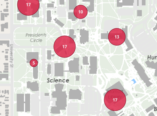
I'm trying to display an ArcGIS Online mapviewer (the new mapviewer) that shows locations of incidents. The incidents are spatially coincident (due to the way the data is reported) and the updated clustering ability in the new mapviewer is the perfect way to display this information.
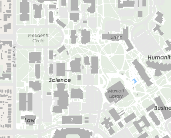
The issue is that used in the ArcGIS Dashboard app, the clustering symbology does not display until the map is zoomed. Seemingly minor, this is a big issues as the dashboard is meant to be a public facing app that doesn't necessarily depend on users interacting with the map. Without zooming, the map will appear blank. Here are some other details:
- Using New Map Viewer with a custom cluster symbology
- Data is a hosted feature layer in AGOL
- Normal (un-clustered) symbology works as expected in the Dashboard app
- Works fine in ArcGIS Experience builder (per a quick test load only)
- Clusters use a label (for feature count) - this label shows up fine (even when the symbology is missing)
Link to the dashboard app: https://universityofutah.maps.arcgis.com/apps/dashboards/459a08c769864cc3965e566fb7119af3
(The app is for demo only, and therefore subject to change. The data in the app is fake, built for visualization purposes only).
Here is the view as it is (pre pan/zoom) and a view as it should be (after pan/zoom):
Any help or advice is much appreciated!