Hi all,
I used the Hot Spot analysis tool in ArcGIS Online to identify the cities and townships where significant clustering of population growth ("hotspots") and population decline ("cold spots") occurred from 2010 to 2020.
The results are displayed below. However, the results for the tri-county Detroit area (contained within the green box in the first map) are not what I expected.
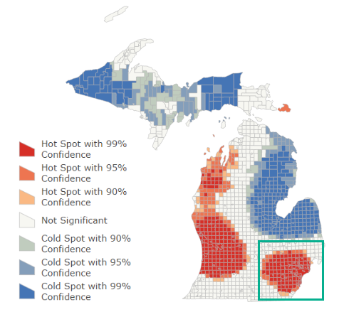
When I look at a closeup of that same area--but on a map that displays the percentage change for the population gains and losses as graduated greens and purples--I see a lot of the interior of Wayne county (where the city of Detroit is located, shown with the green box drawn around it in the second map) actually experienced population loss, yet it is identified as part of the significant hotspot in the first map.
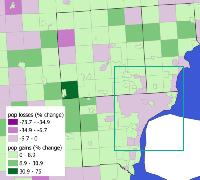
My goal is to see where clusters of growth and decline occurred at a subregional level.
To achieve this goal, should I be using a different spatial stat (other than the hotspot tool) altogether?
Or should I use the hotspot tool and just choose different spatial parameters that better model my data?
ArcGIS Online only has the "Distance Band" option to set spatial constraints for cluster identification, but more options for settings (e.g.,"K nearest neighbors" or "Contiguity edges only") are available in ArcMap 10.7.1 that may be a better fit.
I should add- there are a total of 1,516 polygons that are relatively consistent in terms of area/size. As a reminder, each polygon represents the percentage change in population between 2010 and 2020.
Thanks in advance. Ashley