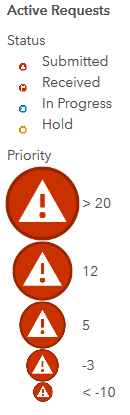
I'm putting together a webmap of project data, and have point data symbolized by type and size. The legend that AGOL makes for this separately shows the array of types (project status) and the range of sizes (project priority). Great in theory, except the part that shows types reduces the symbol sizes so much you can't make out anything except colour. I've already adjusted the sizing properties so that the minimum size is clear and readable, but that doesn't seem to affect the way the types are shown in the legend. My example is below. Is there any way to set the type symbols to a more reasonable size in the legend?