Hi everyone,
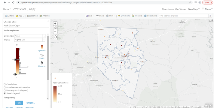
I am trying to create a Counts and Amounts (color) map using data we have collected by zip code in ArcGIS Online. I would like to have the zip codes shaded based on the number of Adult Summer Reading cards that were completed by each area. However, when I've tried to upload the .csv file of the data (attached) it puts a single point on the map for each zip code.
How do I tell ArcGIS to use the shape of the zip code boundaries for the data I'm trying to use instead of displaying the data as points so viewers can easily and quickly look at the map and see what areas we need to increase our outreach in or where we were successful?
Any ideas, links to similar issues/solutions, or advice is greatly appreciated!
Thanks!