Hello,
I'm just starting to explore Experience Builder and think it has a lot of potential and many applications to what we want to show. One of the areas I am exploring is trying to replicate Tableau dashboards and I think Experience Builder might be a possible substitute.
We use Tableau extensively in many of our story map reports and sometimes they do not function as well as I would like within the story map. So my thinking is if I could create something similar, or maybe even better, from within the Esri universe, then things will run smoother. Tableau has its place and works well on many levels, but I want to move away from relying on it for charts and graphs.
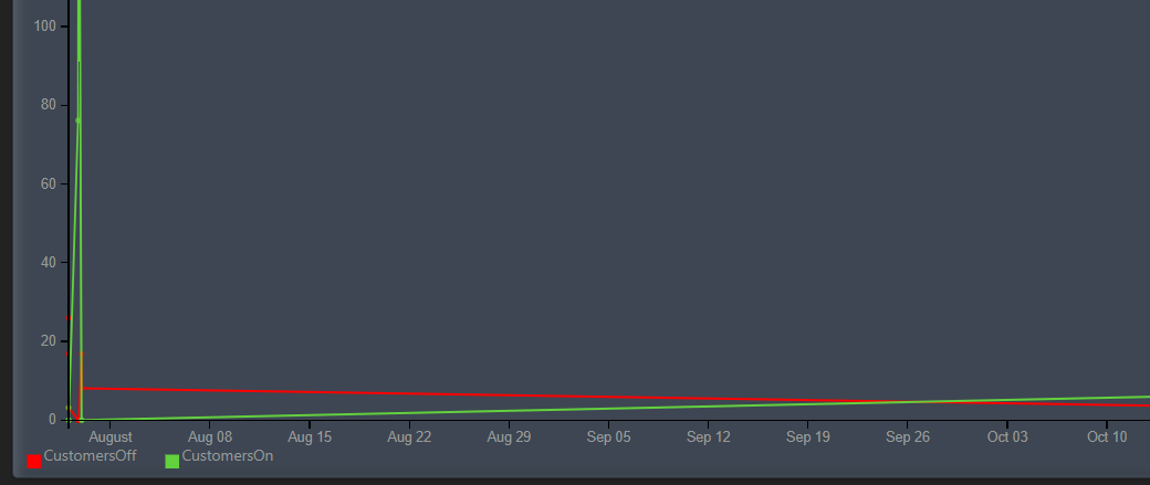
So that brings me to the point of this post. I was able to create a rudimentary bar graph in EB comparing area of forest land and area of timberland. The next step, and it is a big one for us, is being able to show sampling error bars. We have the SE data and it is attached to all of our data, we just need to show it.
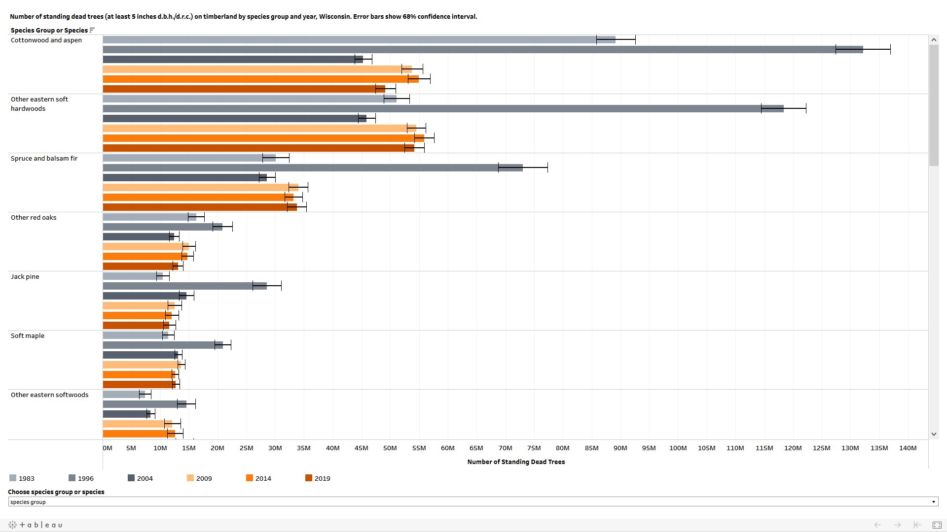
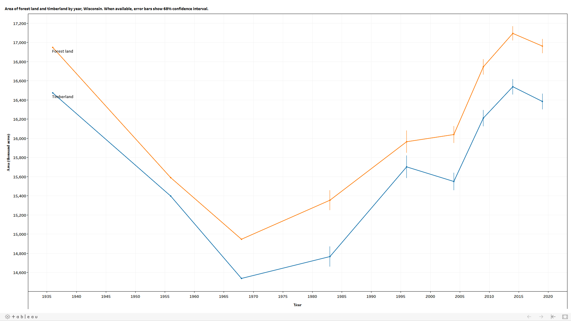
To give examples of what I'm trying to accomplish, here are two styles of Tableau dashboards showing number of standing dead trees by species group and year, and area of forest land and timberland by year. Both show error bars and are for Wisconsin. One is a bar graph and one is a line graph.
Thanks for your help!