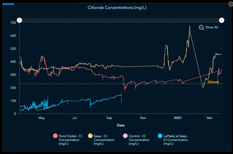
Hi all - looked for an answer to this but I can't find the right one. Seems basic - I have a serial graph (line) shown below. I have several time periods during which data wasn't collected (gaps). In the spreadsheet, those are blank cells (graph is based on a CSV I upload as a hosted layer). I don't want to show the blank values as this misleads the viewer into thinking that there was a drop in concentration - when in fact I just don't have data for that time period.
I tried using a filter for null values but this didn't give me what I was looking for - perhaps I'm doing it wrong? Also, this seems like a basic thing - don't interpolate between values (it's not set up as a 'smoothed' line type). Just don't show anything. Can anyone help? I'd share the actual dashboard, but it's for a client that doesn't want that to happen. Thanks in advance.