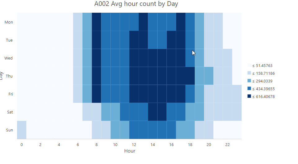
Hi All
I have a script that loops though a dataframe, runs a query and exports each subset to a feature table. Then i use arcpy.chart to generate calendar heat charts. I have set the classification method to 'natural breaks' but that gives be classes with heaps of decimals (see attached). Is there anyway to round the class breaks? I am exporting them to svg's so I guess I could do some sort of replace, but just wondering if there is an easier method?