Hi everyone. I am developing a web application to allow users to search for points within a set location and distance - using the Near Me tool - and I am keeping mobile configurations in mind as we want it to be accessible for all.
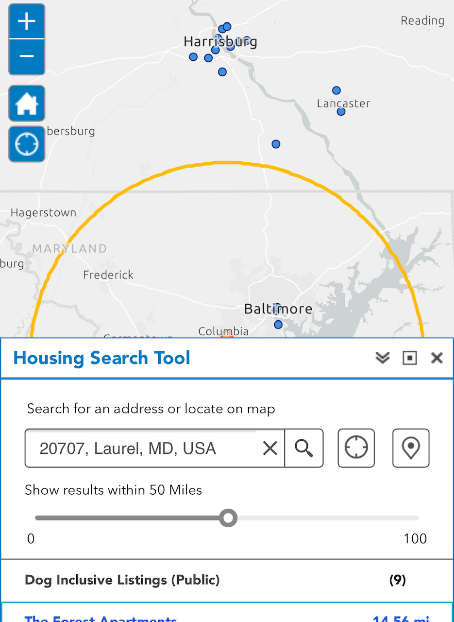
I am under the impression that I should keep the application as simple as can be for this to be possible. However, I am now struggling with the general placement and zoom extent of the map. When I use the "Near Me" tool and it zooms into the map as it searches for the location, half the widget's buffer and results are covered by the widget panel itself. Is there an easy solution for this that I'm not seeing? Please help!
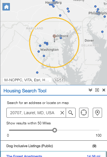
EDIT: Also, the map extent for the "Near Me" tool after searching is perfect on the "Preview" tab of the web app itself. It's just once you actually bring it to a mobile device, the results show as if the widget panel weren't present. Upon digging into this further I realized that if I toggle on and off the tool on mobile before using it, the map extent works properly as shown in the preview. The issue with this is we want users to know what to do right off the bat, rather than needing to click a button to find out.
A screenshot of the actual example on mobile is attached below vs. what is shown on preview. Any other resources for creating mobile-friendly apps are much appreciated. Thank you!