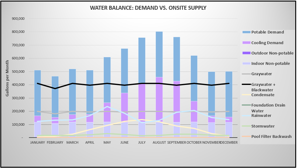
I want to create a chart that looks like the screenshot below. The three demands need to be stacked bar charts and the supply information need to be lines. The value for each demand and supply is calculated for each month and is its own field in the underlying feature layer. The underlying feature layer is an output of a published survey 123 survey that uses submitter input such as project area and project users to calculate the supplies and demands in the project. Is this possible?