Hi,
For various reasons i only recently got my insights desktop upgraded to the new version, enterprise is still previous 2021 version, and noticed something weird with the heat maps in one of my dashboards which is making me reconsider upgrading enterprise. the old heat map looks like this
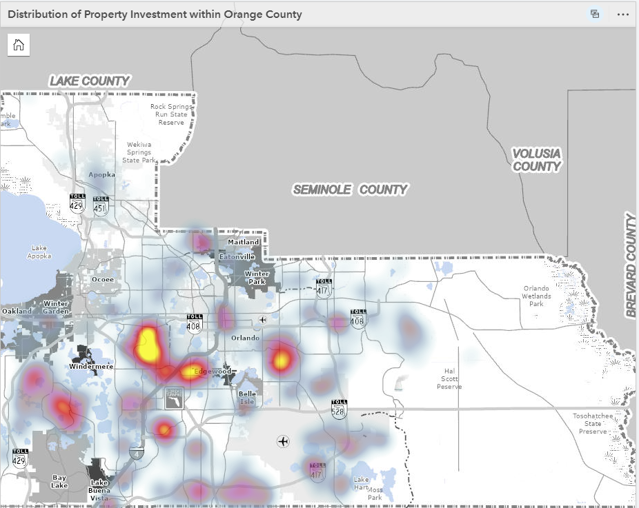
and the upgraded one like this
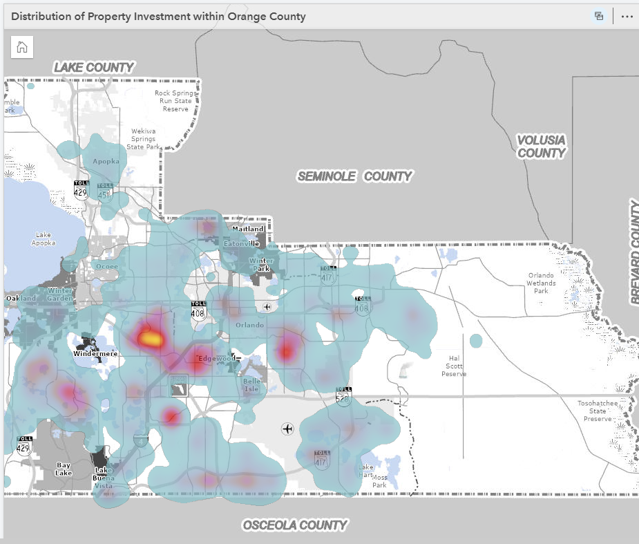
i am assuming the way the heat map shows density has changed. is there a way to filter out the lowest values, i am not interested in them showing in the map, just the hot spots.
Thanks,
Laura