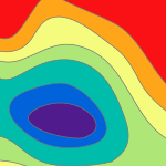
Hey ya'll, When I create the chart I remove all the axes labels, but when I insert it on a Layout the axes labels appear again, and there is a huge gap of wasted space. The labels are too long to read and it messes with the flow. I've tried inserting a legend in the chart, but the option is grayed out. Formatting the charts is the single most frustrating experience of my life and I want to write a strongly worded letter to someone. Thanks!! #display of charts
Angemeldete Mitglieder können Beiträge verfassen, Updates folgen und mehr. Neu hier? Registriere ein kostenloses Konto.
Find useful guides, FAQs, and documents to help you navigate and make the most of Esri Community.