Hi
The web app I have created in Web App Builder Developer renders really well on desktops, laptops and tablets. However there is an issue on a phone where the search bar is hidden by a header on initial load.
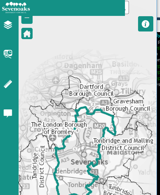
Rather than the main header, it looks like the header from the side panel as it is exactly the same width as the panel is when expanded. If the device is rotated to landscape and back again, although the logo still looks wrong:
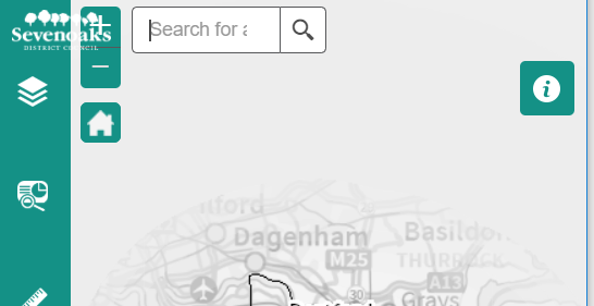
I would like to tidy this up and the two options and I reckon there are two options:
1. Hide the logo when and header area from the side panel on a mobile device/small screen
2. Reinstate the main theme header on mobiles - this will prevent the zoom buttons and search window being shifted up and therefore they will not be obscured. I expect this may be the easier option but means there is less space on the screen for the map.
Does anyone know how I may go about making one of these adjustments - I have looked through the files and can't work out what makes it display differently on smaller screens.
Thanks in advance