Hello!
not sure if it is another gift from the recent update:
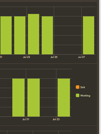
I do have 3 charts one on top of the other showing data for different people. all of them set up in the same way.
when I have more than one series (depends on the filter) everything is fine like the first pic:
but if that month only a series is supposed to show, the legend disappears. this created imbalance among the 3 elements and it is annoying. Apart from the fact that if one does not know what that green means, it is just not practical.
Am I doing something wrong?
Thanks!