Hello all,
Less of a question - more an observation and perhaps I should move this to the Ideas page. I think I will start an Esri tech support case to document -
I started working with the Themes in Experience Builder and I started having a sneaking suspicion that the colors used in the themes were not contrast accessible in the header/text/widgets icons.
So I started a new Experience Builder app from scratch to test this using the Create New - Foldable template. I went to Theme and picked Ocean. And then I used https://webaim.org/resources/contrastchecker/ to check the subtitle:
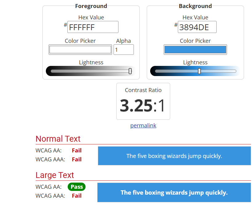
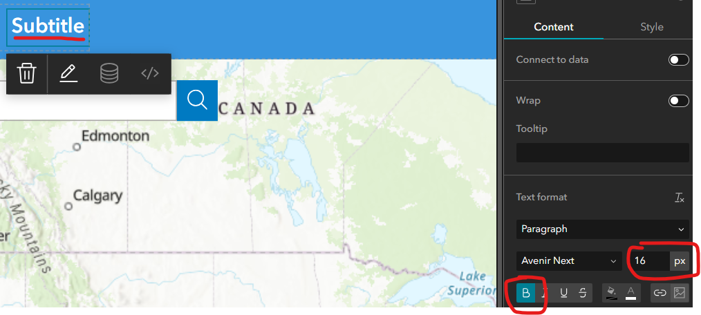
Oh, well, it passes for "large text" - that's what the default subtitle is, right? Wrong:
"Large text is defined as 14 point (typically 18.66px) and bold or larger, or 18 point (typically 24px) or larger."
Then I checked the icons for legend, map layers, and basemap gallery that are added automatically in this template. This looks bad to me and I don't have color accessibility issues.

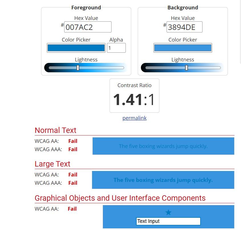
At least the white icons within the blue box meet the contrast requirements.
And so I checked Astro:
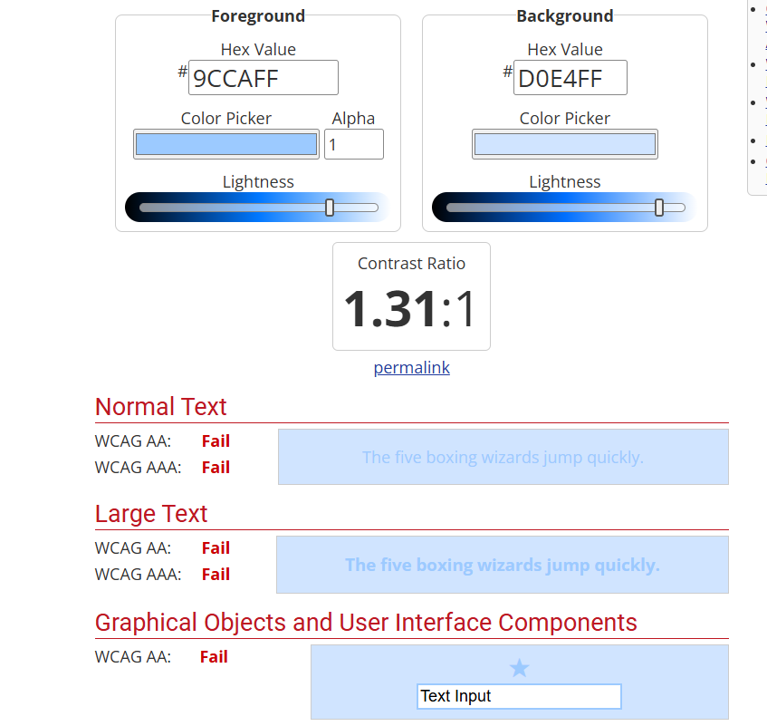
Prime:
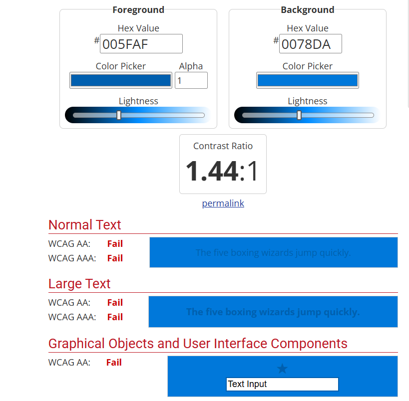
Velvet:
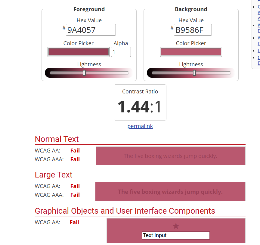
Abyss:

Calcite:
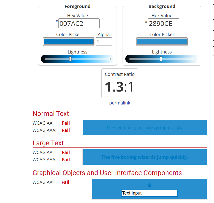
Meadow:
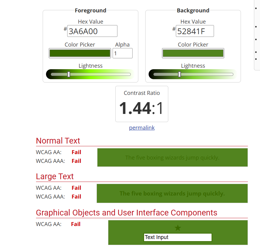
All failing for graphical objects and user interface components.
What in the world, Esri?? The six default themes have optimized color contrast for each band I'm not sure what 'each band' is supposed to mean. So I hope I have something wrong here. But no, no, they don't.
PLEASE change this.
Thanks,
Andrea