I have a parcel application utilizing sidebars around a map. One sidebar contains a Query widget, which is configured with the "Zoom to" action upon feature selection. Automatic zoom setting works great on desktop, but on mobile I am having trouble effectively zooming to selected parcels due to the small map extent on mobile screens.
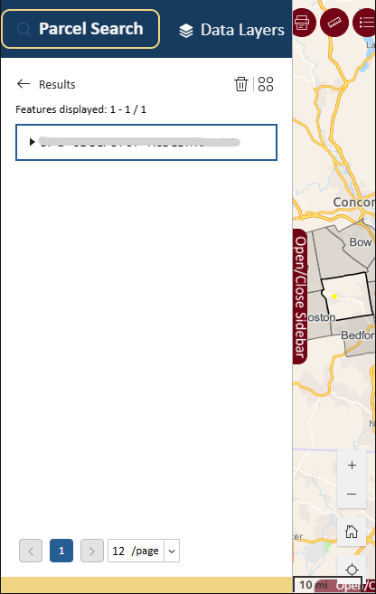
The ideal functionality for me is for a mobile user to select a parcel and close the sidebar to view it. Unfortunately, I cannot set a custom zoom scale on mobile without it also affecting desktop view.
My best idea so far is to set a custom zoom scale of 500, which would encapsulate about 60% of parcels on desktop (which isn't great), while at least being able to see an average-sized selection at the neighborhood level on mobile.
Is there another way around this? My goal is to resolve the issue without changing anything fundamental in the design, especially on desktop, as the client has already approved the look and feel of the application.