This could be more of an idea rather than a question but I figured I would pose it as a question first. I am creating a "dashboard" in EB because you can make them look way cleaner and a lot less.... Windows 95. However, some of the chart configurations seem to be limiting.
I want to color the "Carbon Flux by Region" Graph to match the other graphs. Unfortunately, you are unable to choose custom colors unless you use the "Split By Field". When I do a split by the Region, it breaks the chart, which makes sense.
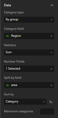
I am just wondering if I am doing something wrong in my setting to allow this customization. If I do use the Split By Field, it does give me what I want but the chart gets super funky, not aligning the data with the category, and then when I go to change the colors, the HEX box seems to be broken. My data has two fields of Region so I use Category = Region and Split by = area (same thing) and it gets out of control.
Any help is appreciated.
1. How I want my graph to look but instead with a color scheme that matches the map and "By Forest Type" graph.
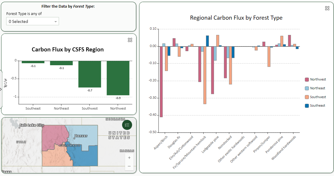
2. The configuration of the Carbon Flux by Region Graph. (Green Bars)
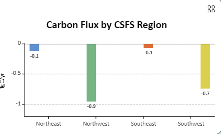
3. What happens when I use the Split by Field. Notice the bars not aligning. Also sorting by Value does not work correctly but I am assuming the Split by really makes things interesting. Does allow Series Customization but when I change the Colors using a custom HEX code, it does not accept, this continues to occur when I refresh the browser too.
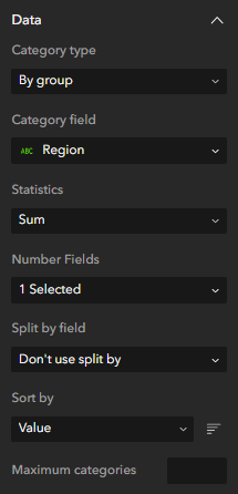
4. The configuration setting for above graph.
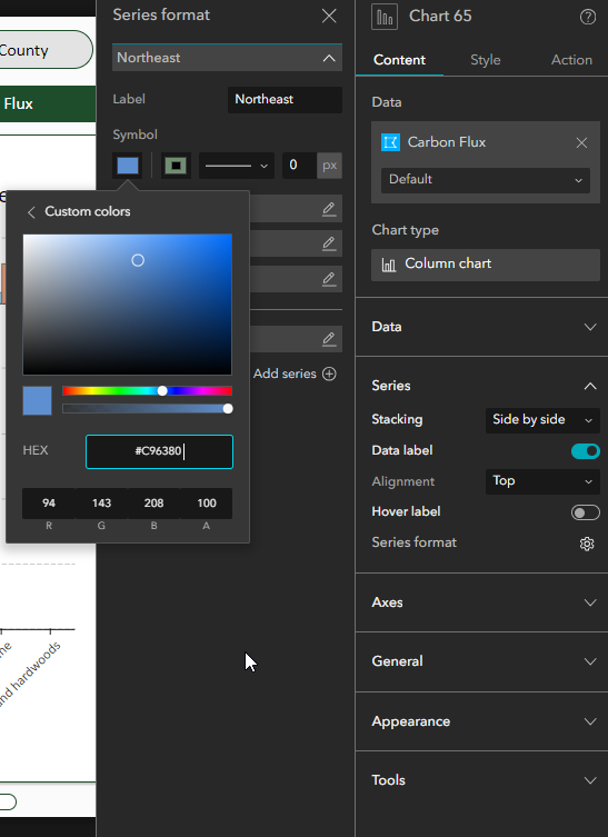
5. Formating the series, and inputting a custom HEX code that will not update the color chart. Wondering if it is a bug or the split-by field just REALLY screws some things up.