Hello, I wish to create a pie chart that represents certain areas on my map and what their sediment composition is made of. When I right click on my csv file and click "Create chart" the pie chart option is not available. I only get options for bar chart, line chart, histogram, scatter plot, and a few others. I have the sediments and their respective percentages within my attribute table. additionally, Id like to make it so that the pie charts are visually on the map. It seems like you can only do this on ArcMap though, not ArcGIS Pro. Any tips or suggestions would be awesome. here is an example of what I would eventually like to see on my map in ArcGIS Pro:
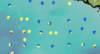
different colors representing different sediment types.