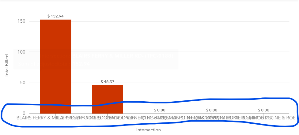
I was working on an Insights report when I noticed that labels on the column charts only auto-rotate if more than 5 columns are present. Therefore, if your column names are long and if you have 5 columns or less, the labels overlap.
However, if you have more than 5 columns, the labels auto rotate and shorten, making the charts look much cleaner
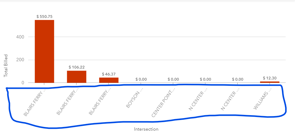
It would be great if we had more control over the chart labels to make sure that they look clean and work with our data