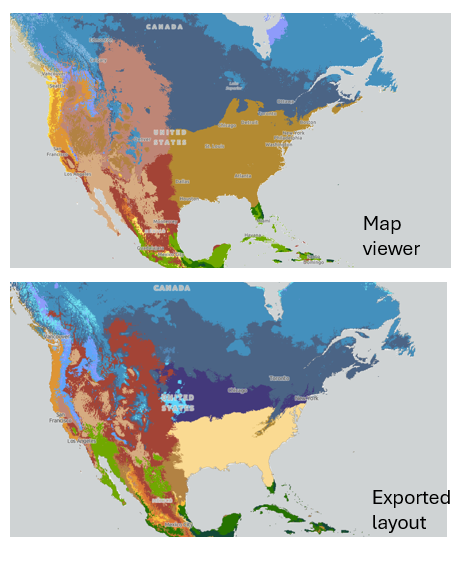
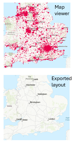
When using Print from Map Viewer to create a layout, sometimes the output does not match the map.
Example: Koppen Geiger climate classification - colours are different
Example: Population, when symbolised by dot density - dots do not show at certain scales. (Shows fine with original polygon symbology; dots show at larger scales, but arguably the value of point density is in the overview!)
I (and my students) expected the output to be a snapshot of the data, as seen. Is this expected behaviour?