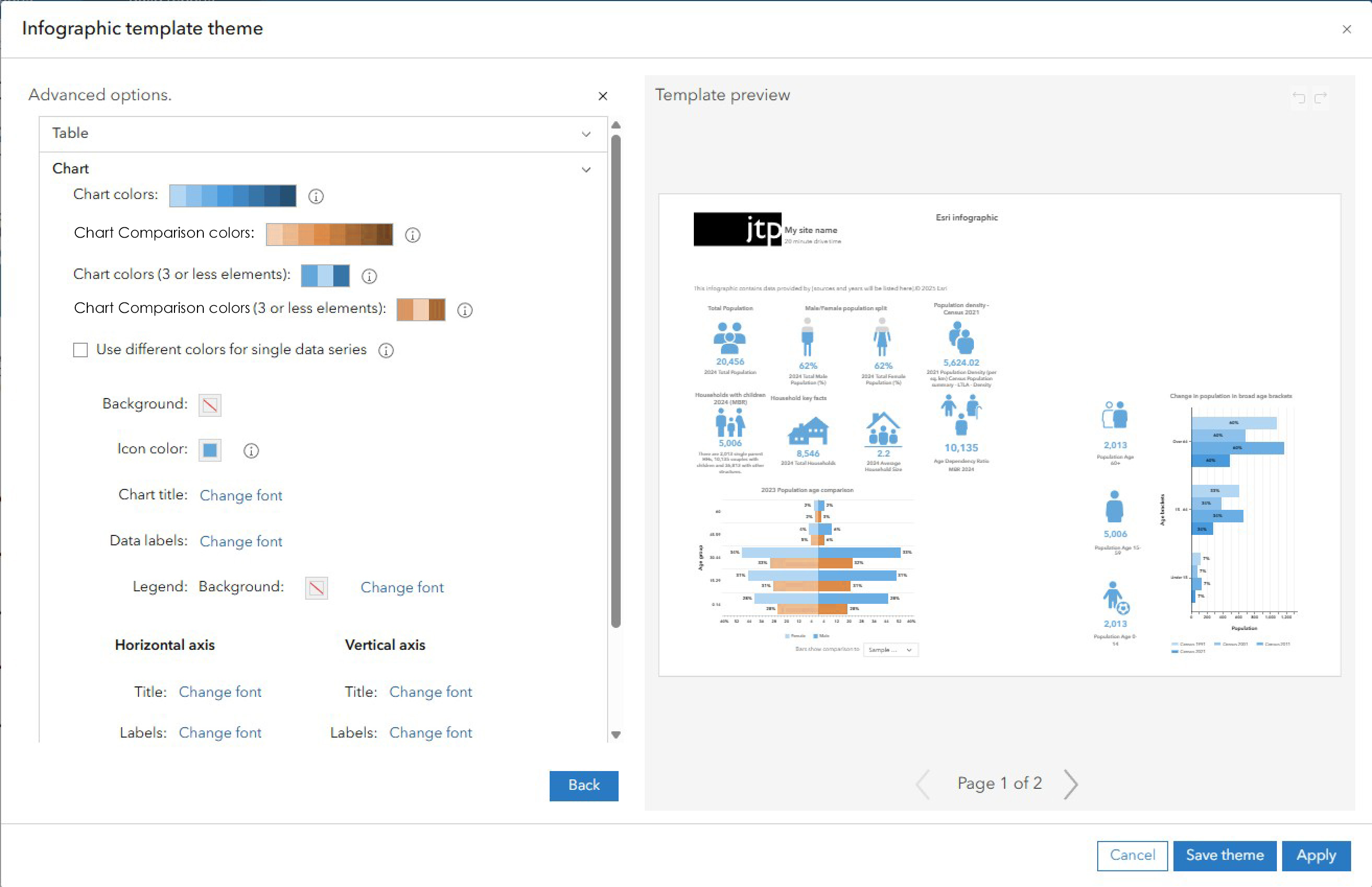
When trying to edit the custom infographics template themes, the colour allocation in what appears to be a gradient, seems to be very bizarre. I've attached some images to help explain.
Current Chart colours application_1.jpg (below) - This shows the current set up with the advanced colour palette. I've numbered the colours so you can see where they are applied. In this image, there seems to be a sort of logic to the application.
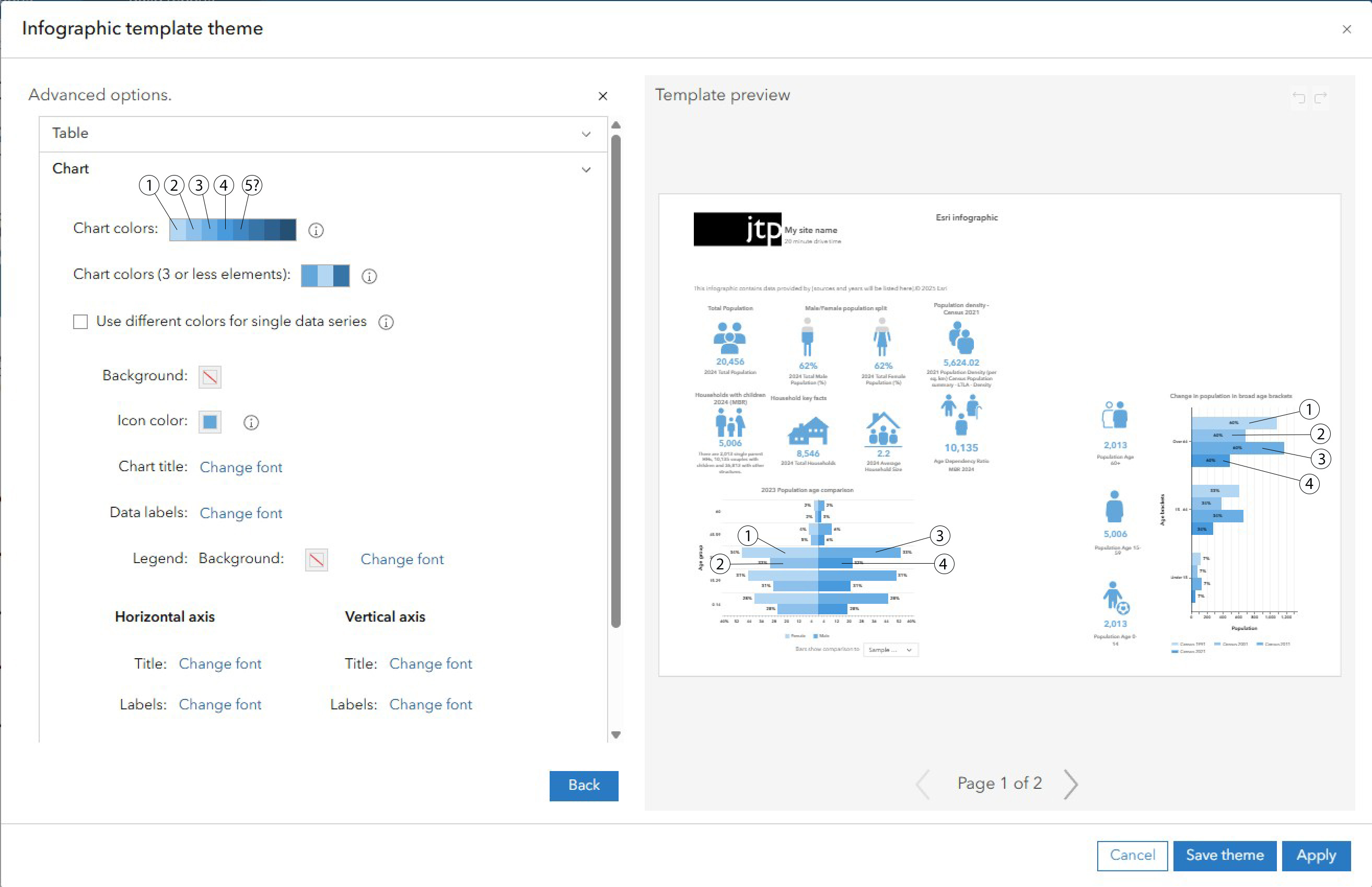
Current Chart colours application_2.jpg (below) - However, this screenshot shows how trying to change the comparison data colours affects the colour palette and the other bar charts. To me, this is very illogical. It appears that the colours are applied in illogical places. If I have a comparison colour, I don't want it to apply to another chart that actually has no comparison on it. This gives a false impression that there is comparison data, which is incorrect for the chart on the right in the example.
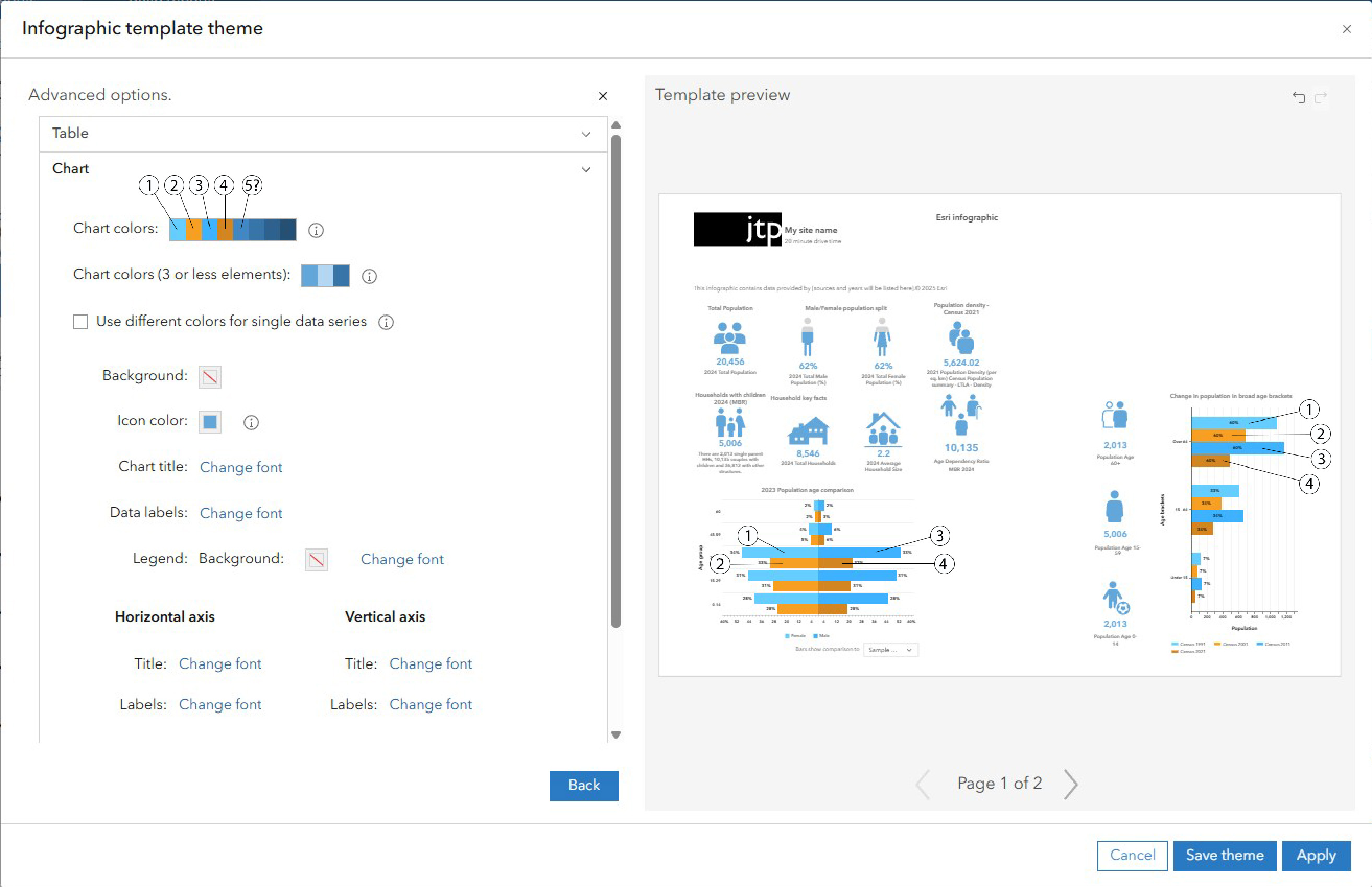
Proposed Chart colours application.jpg (below) - This shows my solution. There should be separate colour pickers for the comparison data, so that they are always differentiated against any other data in the infographics.