Hi everyone,
Recently, while studying classification methods in ArcGIS Pro 3.4, I decided to dive deeper into the Natural Breaks (Jenks) algorithm to better understand what happens behind the scenes. To do this, I worked through two examples in Excel, applying two different methods:
- Manual Calculation (solving step by step on Excel).
- Using the 'Real Statistics Data Analysis Tool' (from this URL for reference).
For testing, I used two datasets:
- [2, 4, 6, 8] with 2 classes
- [2, 4, 6, 8, 14, 22] with 3 classes
Observations:
- In the first dataset [2,4,6,8], the results from both Excel (manual & tool) matched perfectly with the Natural Breaks classification in ArcGIS Pro.
- However, in the second dataset [2, 4, 6, 8, 14, 22], while both the manual method and the Real Statistics tool on Excel produced identical results, ArcGIS Pro displayed different class break values.
My workflow and formulas:
1- Num of Possibilities: get the number of possibilities splits. (for 6 digits with 3 classes = 10 possibility)
1- Mean: get the mean for each class within each Split one by one.
2- Total Variance = ∑(xi−x̄)²
* The Best classification (best split) = Lowest variance
A. Excel:
1. Excel - Manual Workflow:
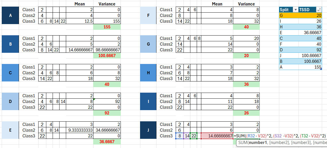
Below is a screenshot from Excel that shows the manual process (formulas) in the tables on the left, along with the total TSSD (Total Sum of Squared Deviations) for each potential split on the right. Notably, the grouping labeled “G” (highlighted in orange) — which places [2,4,6,8] in one class, [14] in the second, and [22] in the third — yields the lowest overall variance. This indicates that it represents the best grouping among the options.
2- Excel - tool:
Meanwhile, using Excel’s dedicated classification tool on the same list [2,4,6,8,14,22] and specifying 3 classes, the tool automatically produces a table that assigns these values into three classes, defined by the minimum and maximum values in each.
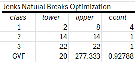
So, as the screenshot illustrates, Class 1 spans from 2 to 8. This means the four values within that range (2, 4, 6, 😎 are included in Class 1. *Which aligned with my manual workflow*
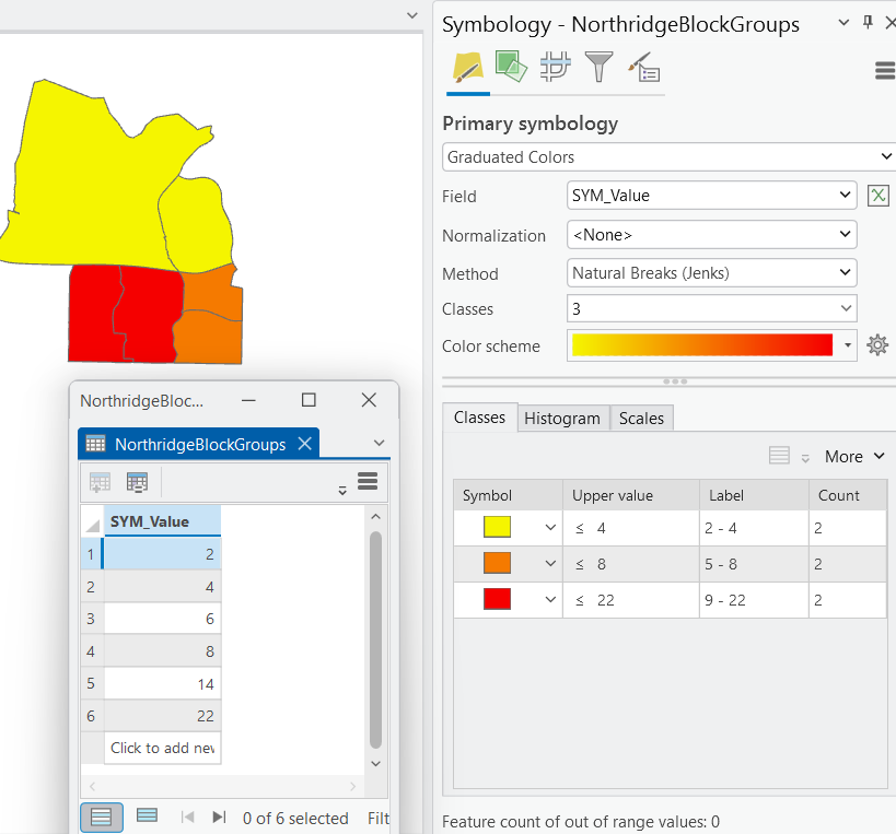
Then, to confirm these results in ArcGIS Pro, a random feature class was selected and a new field called SYM_Value was added to store the same values used in the Excel classification. This setup allowed for a direct comparison of the grouping outcomes between Excel and ArcGIS Pro symbology.
As shown in the below screenshot, when using ArcGIS Pro’s Natural Breaks method with 3 classes and 6 rows/features only with the same values in the excel, the software places [2, 4] in the first class, [6, 8] in the second, and [14, 22] in the third. This outcome differs from the Excel manual approach and the classification tool results also.
So, which result is correct, and what classification algorithm does ArcGIS Pro rely on for Natural Breaks?
Notes:
1- ArcGIS Pro version 3.4
2- ArcGIS Pro field type "Long"
3- Formulas and algorithm reference URL, which recommended by Esri in this web page.