Hi GIS Community,
I'm working with a time-enabled layer in Experience Builder that displays data using the "Counts and Amounts" visualization (proportional symbols/bubbles). My dataset contains data collected every 2 weeks across multiple rounds.
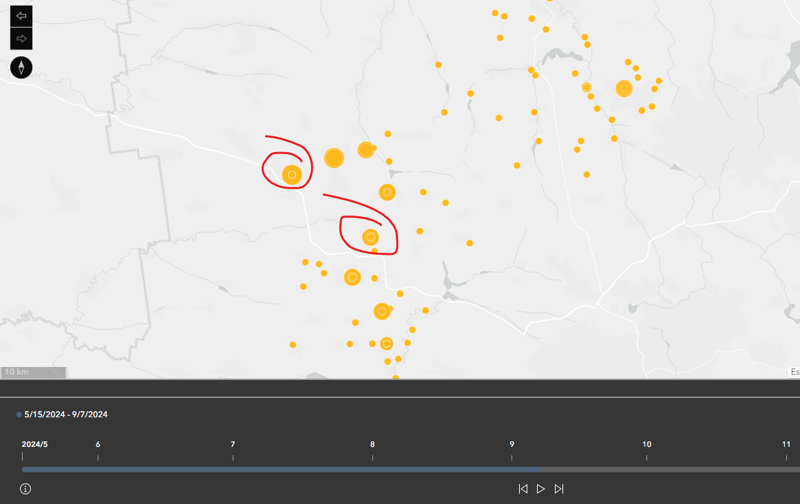
I've encountered an issue where setting the time slider period to anything longer than 2 weeks causes overlapping bubbles to appear on the map, as it simultaneously displays data points from multiple rounds (please see screenshot). For example, if the time slider spans 1 month, I'll see overlapping bubbles for the same location from both rounds within that month.
Is there a way to aggregate the data points within the selected time period? Ideally, I'd like to show a single bubble for each location that represents the sum of all rounds captured within the time slider's current range rather than multiple overlapping bubbles.
Has anyone solved this kind of temporal aggregation challenge before? I would greatly appreciate any suggestions for configuration settings or alternative approaches.
Thanks in advance for your help!
Roman