Update: Seems this isn't possible and will be available in another release
I'm working on a Line Chart in Experience Builder that shows power outages. The information is updated every 15 minutes or so, and is marked in this field with both the date and time:
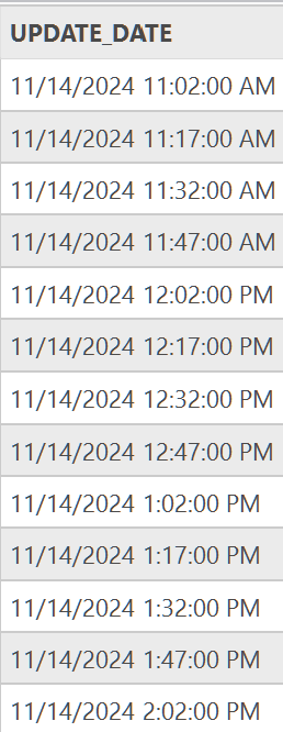
When I use this data to populate the Line Chart, everything works fine, but I cannot change how the X-Axis is labeled
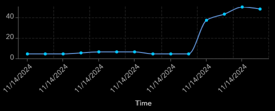
It only shows the date, even though it's clearly broken up by time interval. I've seen the same data be used in Dashboards with only the time element in the axis (The day is pretty irrelevant since it's always today's date). I don't know if I'm missing a setting in Experience Builder than can change this, or if it's not currently possible to do. I've re-sized the widget to make more label space, refreshed the application, etc.
This data is not maintained by my organization so I cannot edit field names or the attribute table. Any help is appreciated!