The new functionality to create charts based on Symbology is awesome! I am using this with Bivariate symbology and the labels in the chart are a little confusing. See the following example:
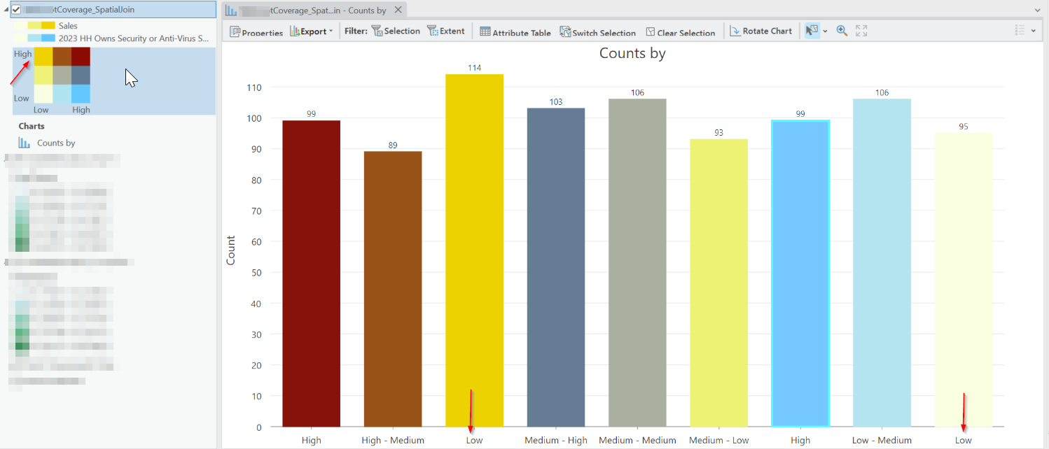
The yellow color denotes low 2023 HH Owns Security...high sales is labelled Low, which does not seem accurate (should be Low High). Blue is labelled High (should be High Low) and it is showing High 2023 HH Owns Security...low sales. The second label denotes High medium (should be Medium High) which is also confusing.
Normally one reads X axis first and then Y axis.
Is anyone else also running into this confusion with chart labels of Bivariate symbology?