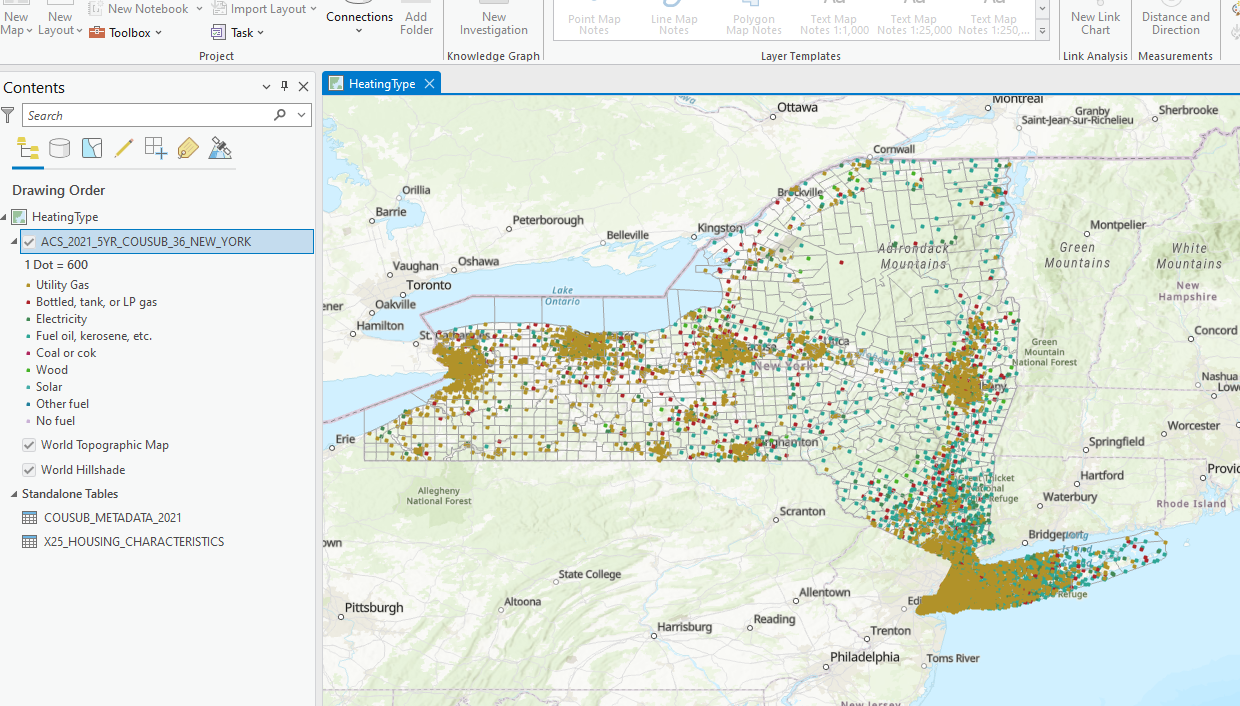
I put together a map of New York showing the type of fuel used to heat a household. See here:
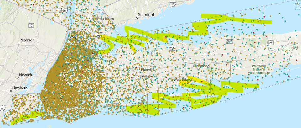
When I zoomed in on New York City and Staten Island, I noticed all these "households" over water. See here:
The data I used is from the American Community Survey 2021 5-year data set.
I sourced my data from this link:
TIGER/Line with Selected Demographic and Economic Data (census.gov.)
Why are data points, which are supposed to represent households, being placed over water?