Allow to apply the symbology that is used for the layer also for the diagram bars.
Use case: Sometimes you may have a hatch fill patterns or dotted line since you are out of suitable colours. When linking the Serial chart to the map/layer you want to make sure the style matches.
For Polygons: use the same fill for the diagram bars
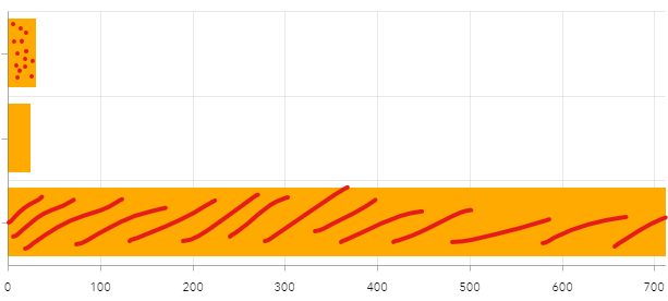
For Lines: use the line symbology and add it in some way to the diagram, like a little legend area
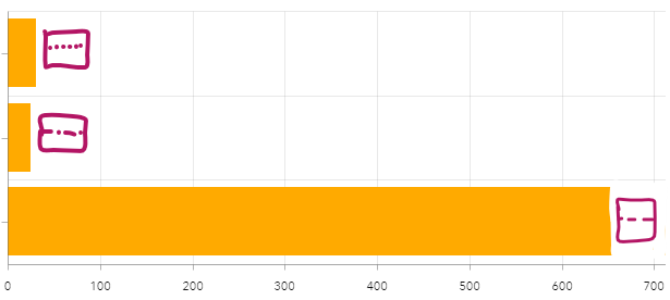
or within the bar/around the bar
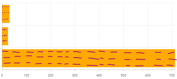
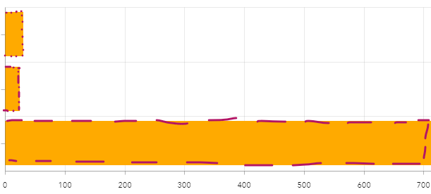
For Points: when using colours and patterns: use those same patterns in the bars (same as for polygons), when using symbols, add it like a little legend in a suitable area (same as for lines)
Related ideas:
Dashboard: charts - Series - Bar Color - By Catego... - Esri Community
Having this option would also allow for better provide diagrams for special needs: Dashboard: charts - Series - Bar Color - By Catego... - Esri Community As in addition to colour also a pattern could be used (why hatched fills are useful is described here nicely: Hatched Fills and How to Sneak Them into ArcGIS Online (esri.com))

