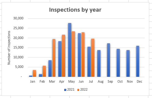
I have a large table of inspections (a layer in a feature service) that includes a date field ('Inspections_date'; example format: 7/11/2022 2:23:00 PM) and spans several years. I would like to create a serial chart that groups the inspections by month and has two or more series to compare years. A simple excel chart looks like the attached (line chart works too). I know that using a data expression can probably get me there, but 1) I'm fairly new working with Arcade and 2) I can't figure out how to group by the date field to parse out the month. I'm also wondering if I should do some of this work in the feature service (grouping by month) instead of in Dashboard. Any guidance would be much appreciated!