I have a dashboard aimed to show the work done by my companies field ambassadors. Specifically, I want to create a graph that highlights the work done by our Field Coordinators that is connected to the map display so we can highlight the entries of one of them.
I have a map of all the points connected to the dashboard, but when I went to create the bar graph, not all the points are being attributed to each person properly.
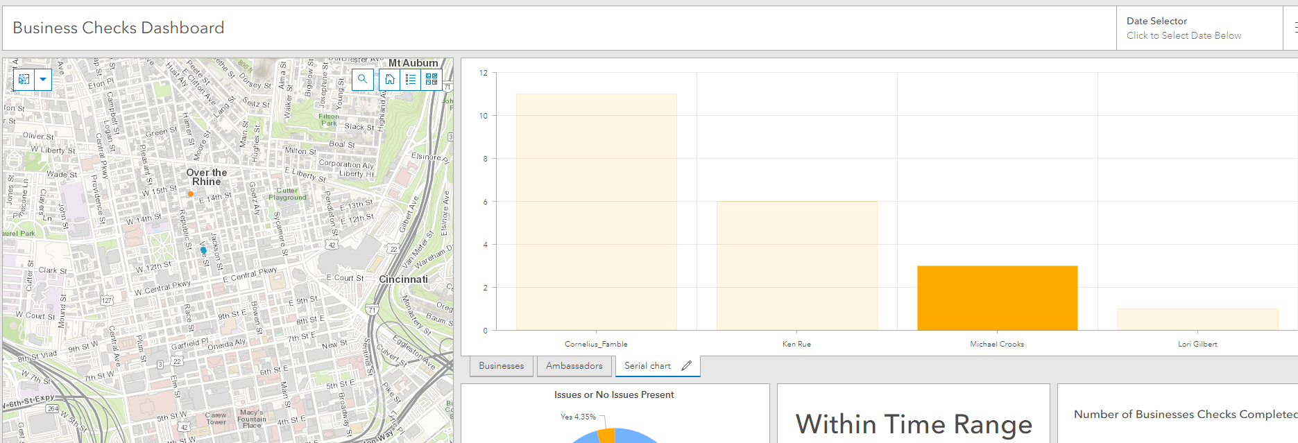
According to the graph Michael Crooks has only a handful of points attributed to him, but he should have at least 55 points if you look at the data tables. Same thing for Lori Gilbert.
Another Issue is that Cornelius Famble's points do not appear when his bar is highlighted. I also noticed that his name is the only one with an underscore between his first and last name.
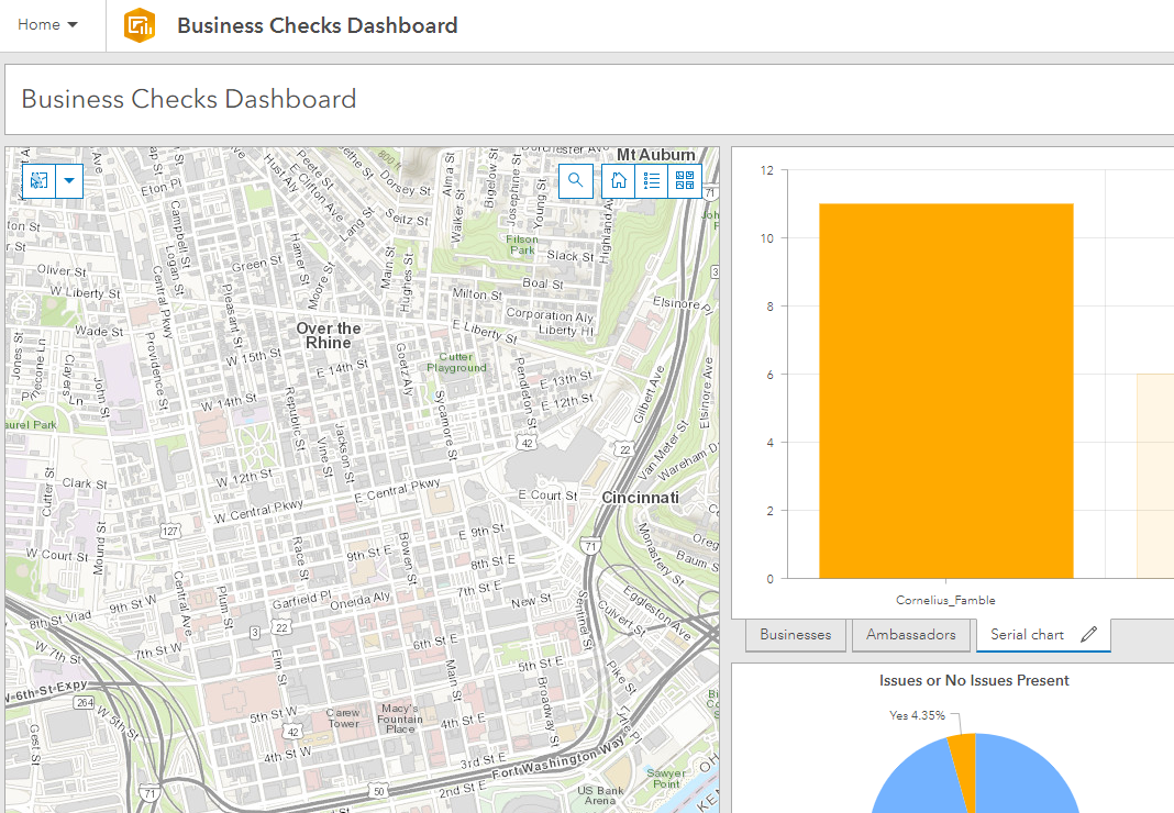
Anyone have an idea what might be causing this? I know there are a lot of layers and they each are linked to the other charts and maps so that could be messing things up.