Good morning.
I am using arcGIS PRO 2.7.
I have a line that represents elevations created using Interpolate shape that run approx 2,000 feet. Between roughly 450 feet and 1100 feet, I need to represent that portion of the graph in a different color.
So far I have only been able to figure out that if I split the line at 450 feet, it creates a new line in the profile graph at 0 feet (the beginning of the chart) and ends at 650 feet rather than filling in on the chart where it actually is.
Below is an image what the profile graph looks like at the moment.
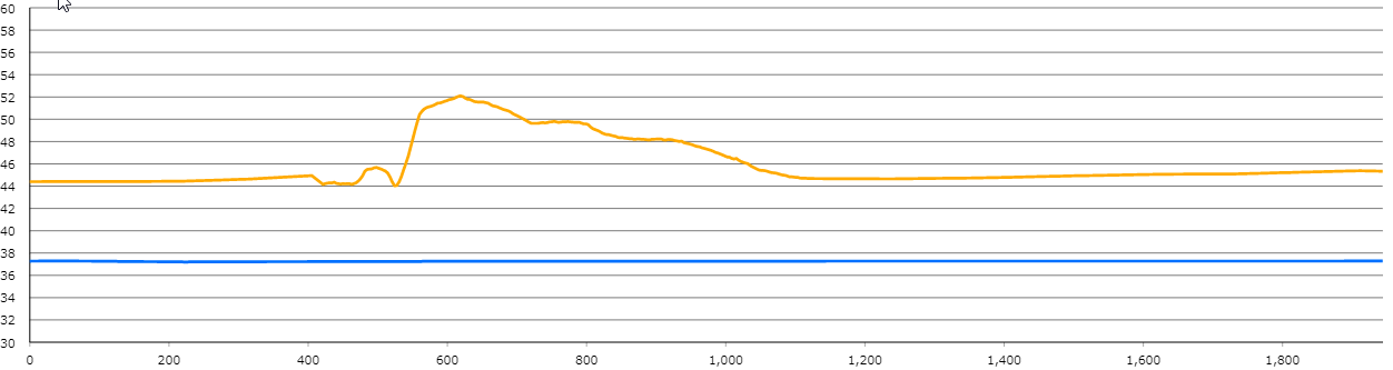
The gold line is what I am wanting to split and the blue line is flood level.
Below is the attribute table for this section.

The flood line is just data from a DEM and made into a 3D line along the same length as the WallLevee. The WallLevee was first created as a 2-D line with 2 heights in each line segment, a from and to. Using those two heights for each line segment, I used Feature to 3D By Attribute. After that I ran Pairwise Dissolve in order to get one continuous line with the elevations.
Not running the Pairwise Dissolve gave me a line for each line segment rather than one line representing the entire ~2,000 feet.
Again, I need to cut that WallLevee line in the middle, but still show it as one continuous line as a different color or different symbology (dashed for example) in order to break it apart from the rest as that is natural ground and not part of any wall or levee system.
Thank you.
Kevin