There seems to be a bahaviour change in the way background image looks in a Dashboard header - specifically the way that selectors look.
In Dashboard Classic, the Selectors "blocked" the background image...

However, in the "new" Dashboard, now out of beta, the background image "bleeds" into the Selector...

In my case, this makes the Selector hard to read, even hard to see that it's there. The selector is fine when you interact with the selector...
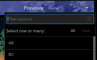
Is this a bug? If it's by design, then there should be a way to apply a background fill or colour to the selector so that it can be made more visible.

